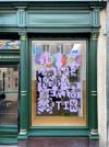
For Herr Menig Optik’s 10th anniversary we created an experimental typographic decal for their beautiful storefront.
Through its unsual design the illustration grabs the attention of bypassers in the historic city center of Nürnberg, Germany.

Full view of Herr Menig Optik’s storefront in Nürnberg, Germany.
For Herr Menig Optik’s 10th anniversary we created an experimental typographic decal for their beautiful storefront.
Through its unsual design the illustration grabs the attention of bypassers in the historic city center of Nürnberg, Germany.

Look at those beautiful details in the illustration as well as the façade!
The main graphic is made up of 10 illustrative squares – one for each year Herr Menig Optik is open. The typeface used is Signal Mono Bold by Production Type.

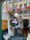
10 year anniversary logo version.
A variation of Herr Menig Optik’s logo advertises the special occasion.
Photo Credits: Michael Menig