Busch & Takasaki Architecture
Visual Identity
Visual identity for Busch & Takasaki Architects in Berlin.
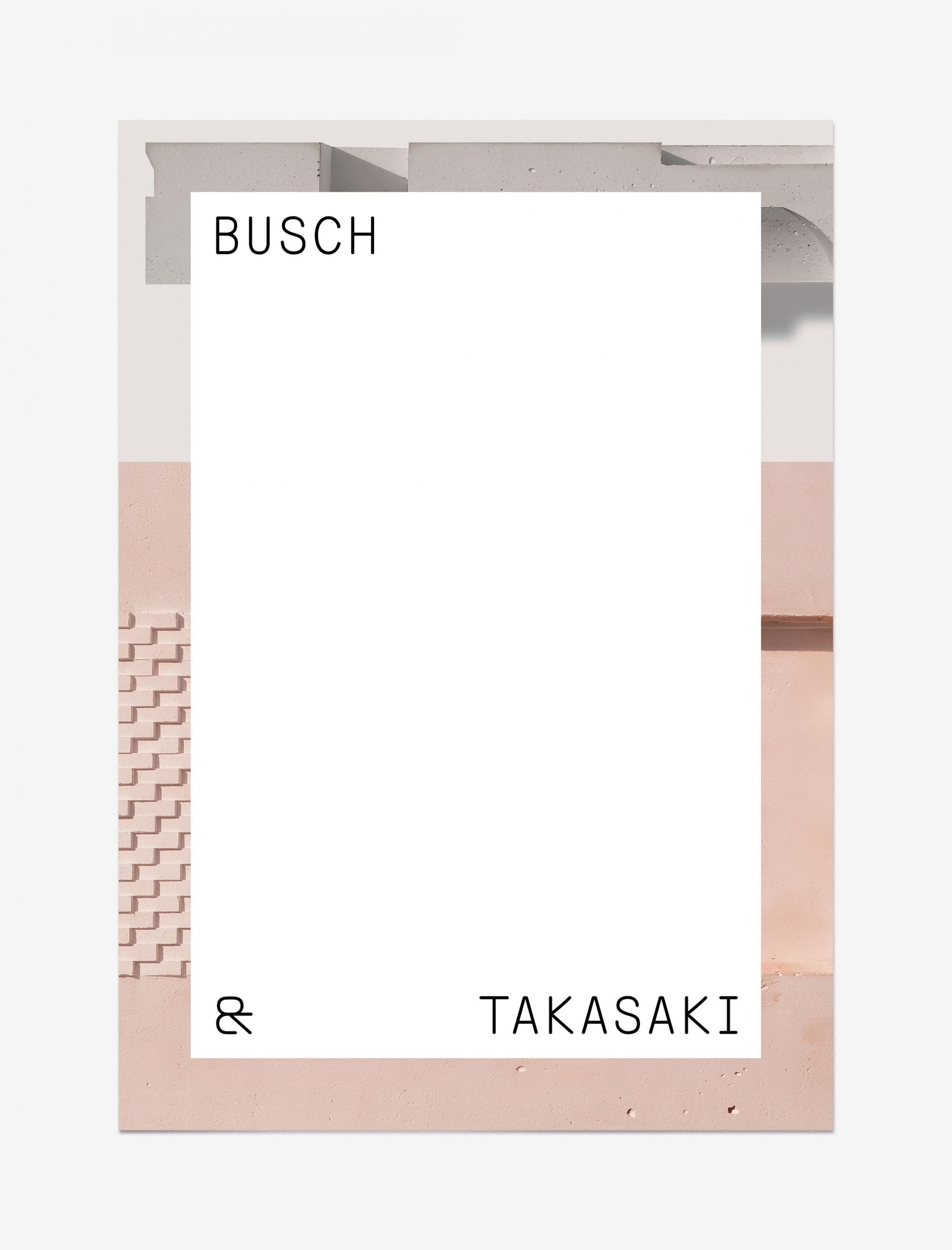
← For this poster design the architects’ models work as a backdrop with a blank slate on top that represents infinite possibilities.
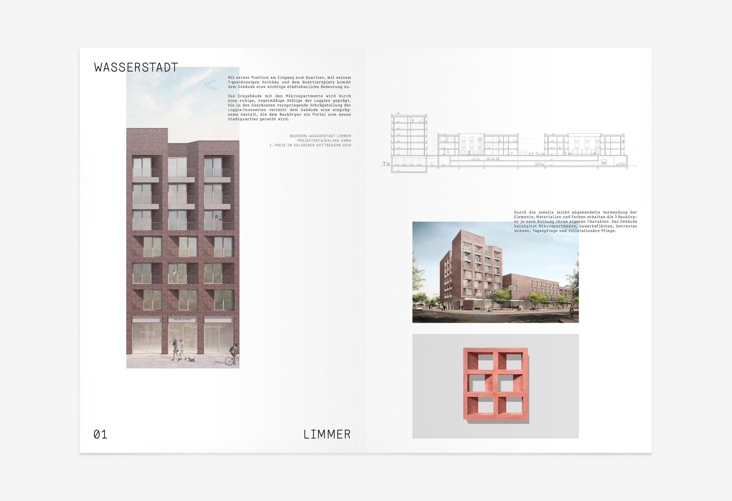
The layout concept for printed matter is flexible and playful, while providing a minimalistic stage for Busch & Takasaki’s architectural images.
“The team at Transatlantika swiftly delivered well-suited ideas for our brand identity. Our new visuals really helped us define the key properties of our corporate philosophy.”
– Julian Busch,
Founder at Busch & Takasaki Architects
The ampersand symbol combines graphical elements of letters of both of the founders names. It is part of their wordmark and also functions as a logo on its own.
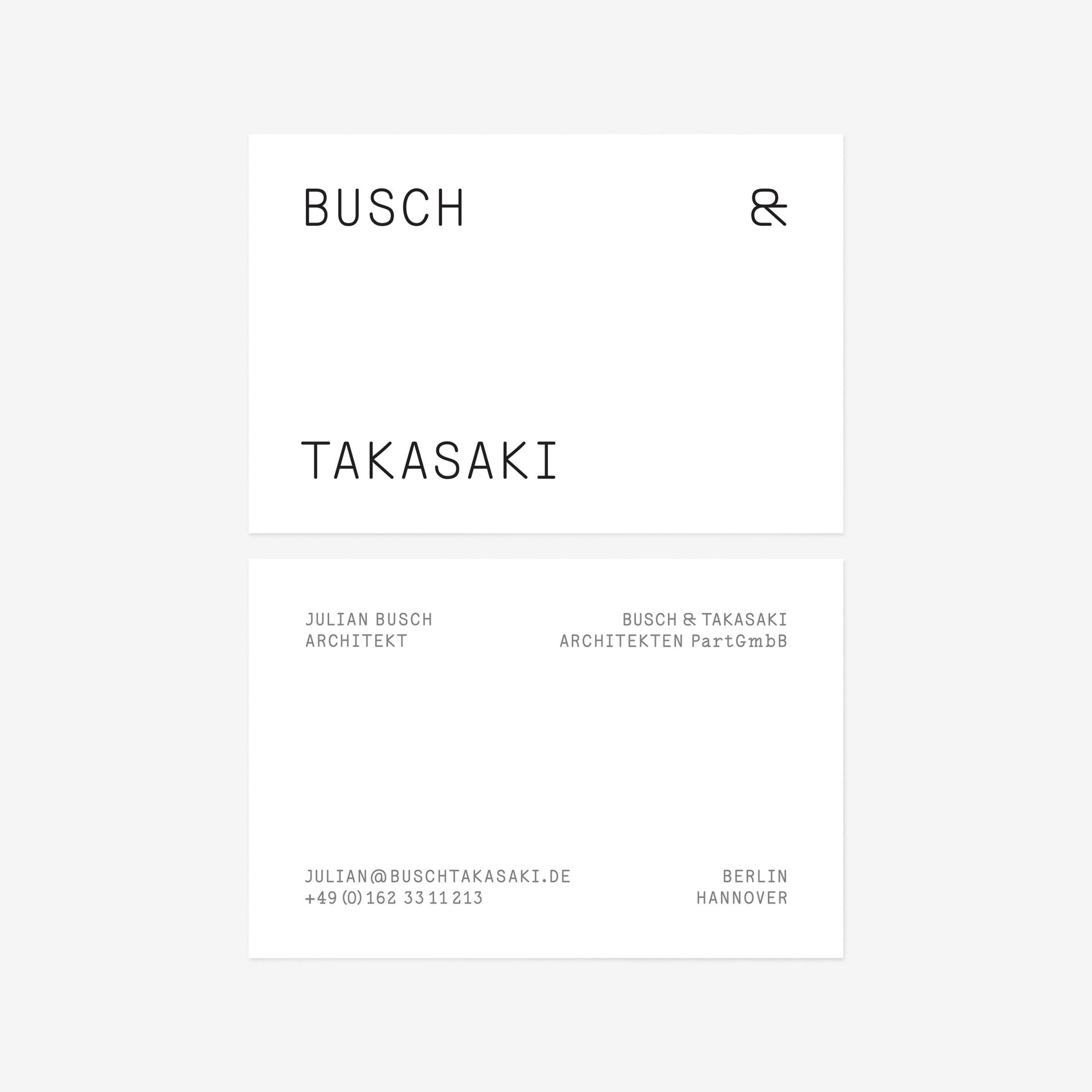
← Busch & Takasaki Architecture business card design
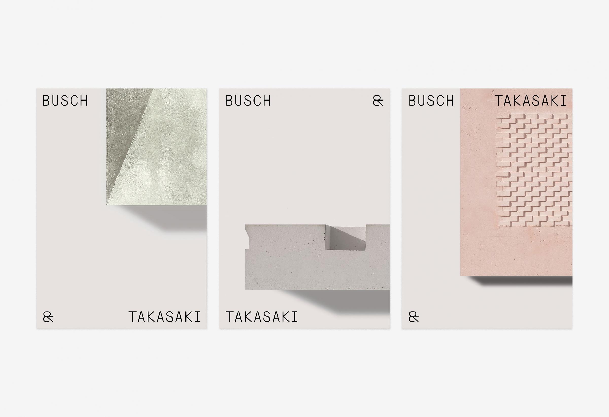
← Postcard designs
The logo works as a layout element framing architectural images.
The brand identity includes two versions of the logo.
One is expressive, the other one for a more conventional use.
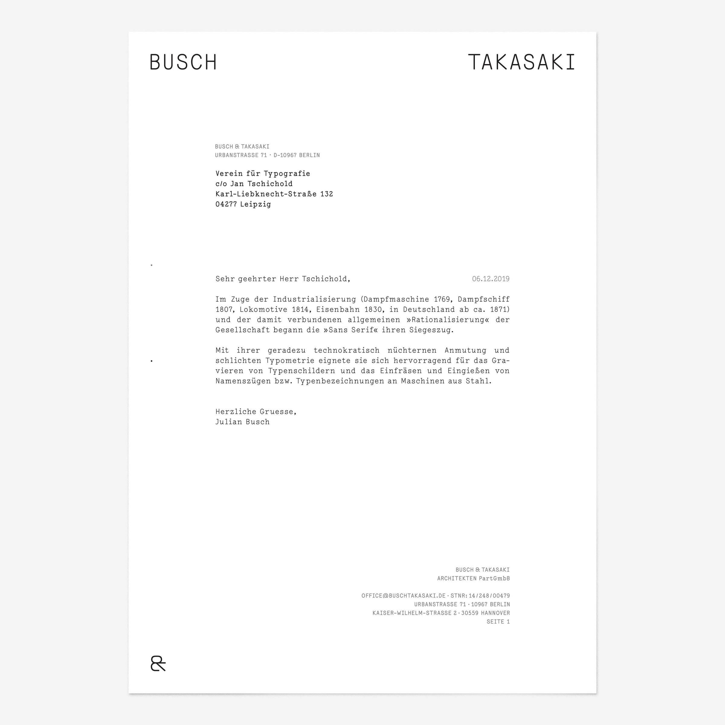
Busch & Takasaki Architecture letterhead design →
↓
Busch & Takasaki Architecture
Visual Identity
Created in 2019
↓
Client: Busch & Takasaki Architekten PartGmbB
Art Direction & Design: Transatlantika