Herr Menig Junior
Kids Optician Identity
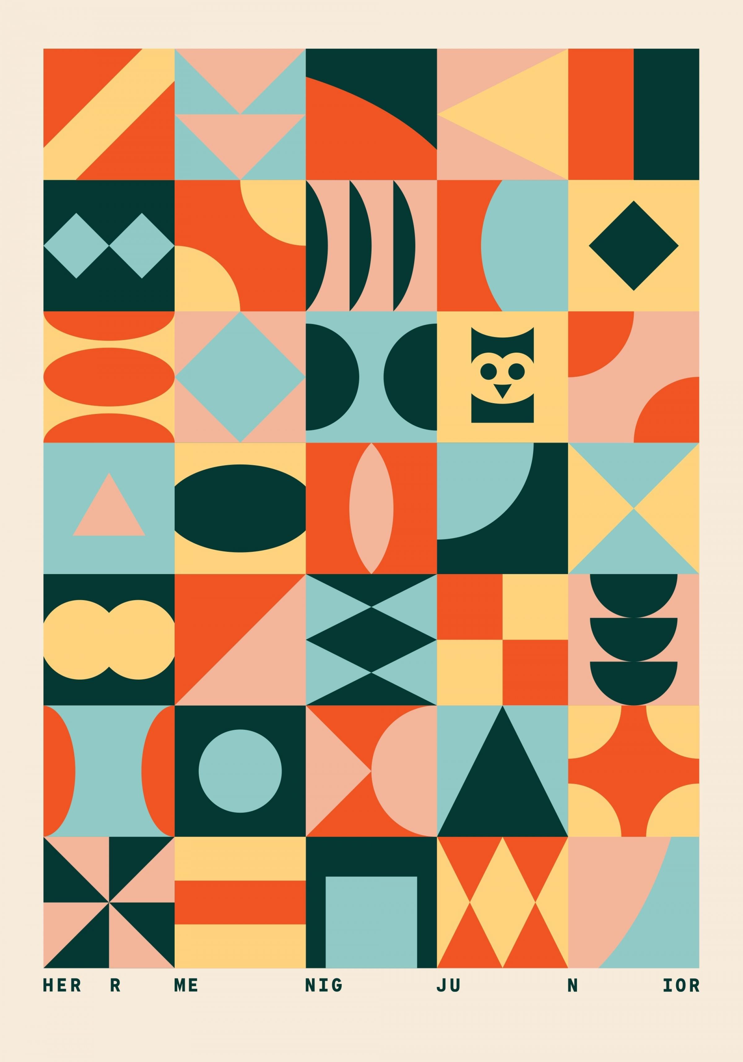
The brand identity for this optometry shop for children features colorful geometric shapes that suggest they can be played with like building blocks. They are accompanied by wacky illustrated characters which are inspired by classic toys.
The retail shop is a playful offshoot of Herr Menig Optik, an established Optometrist in Nürnberg, Germany.
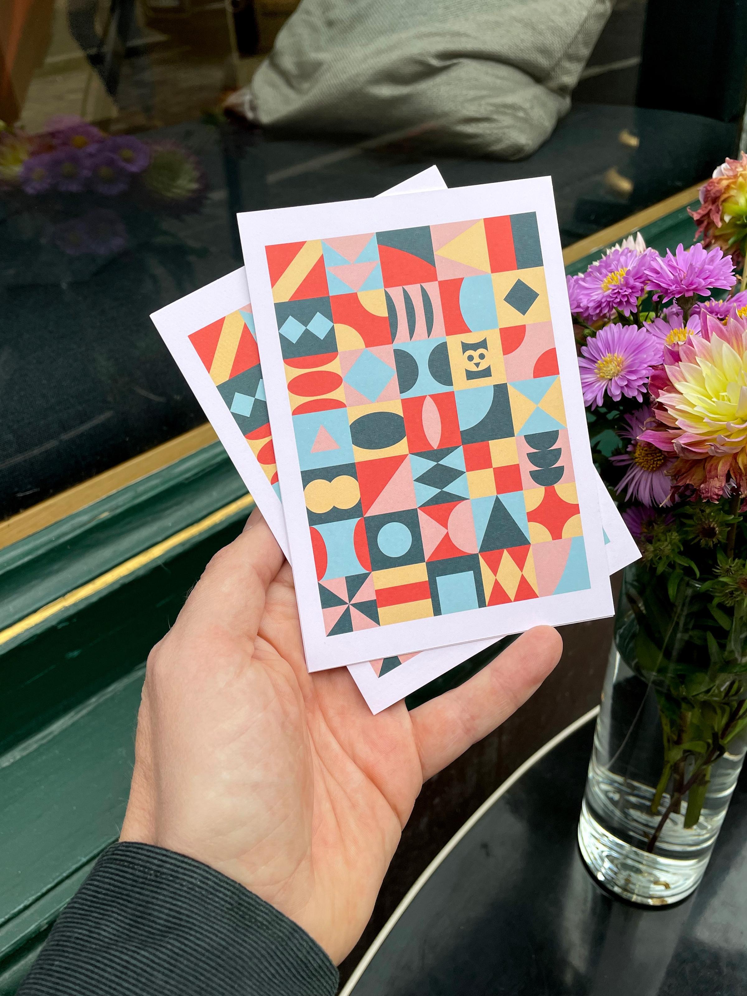
Promotional postcard design and detail of the retail store interior. →
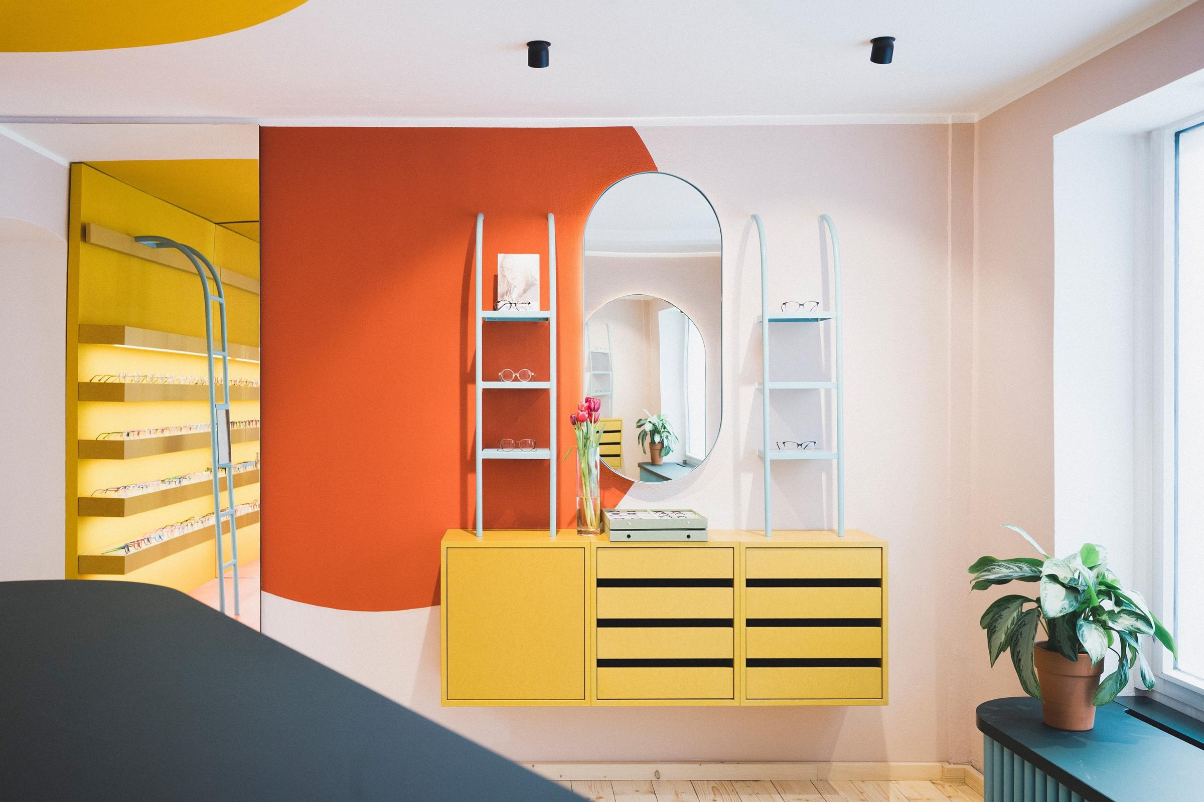
← The extraordinary retail interior was designed by Raum Klaue.
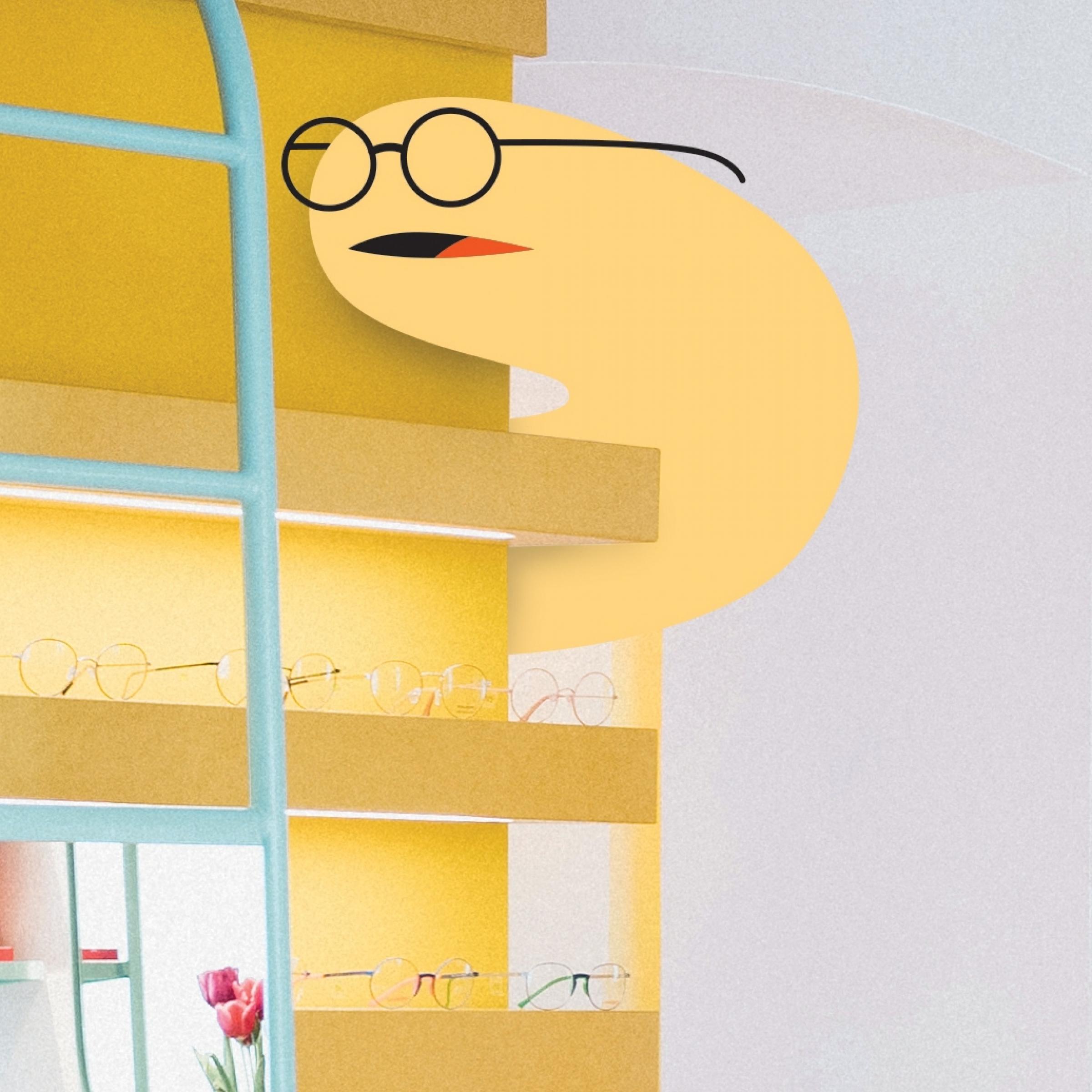
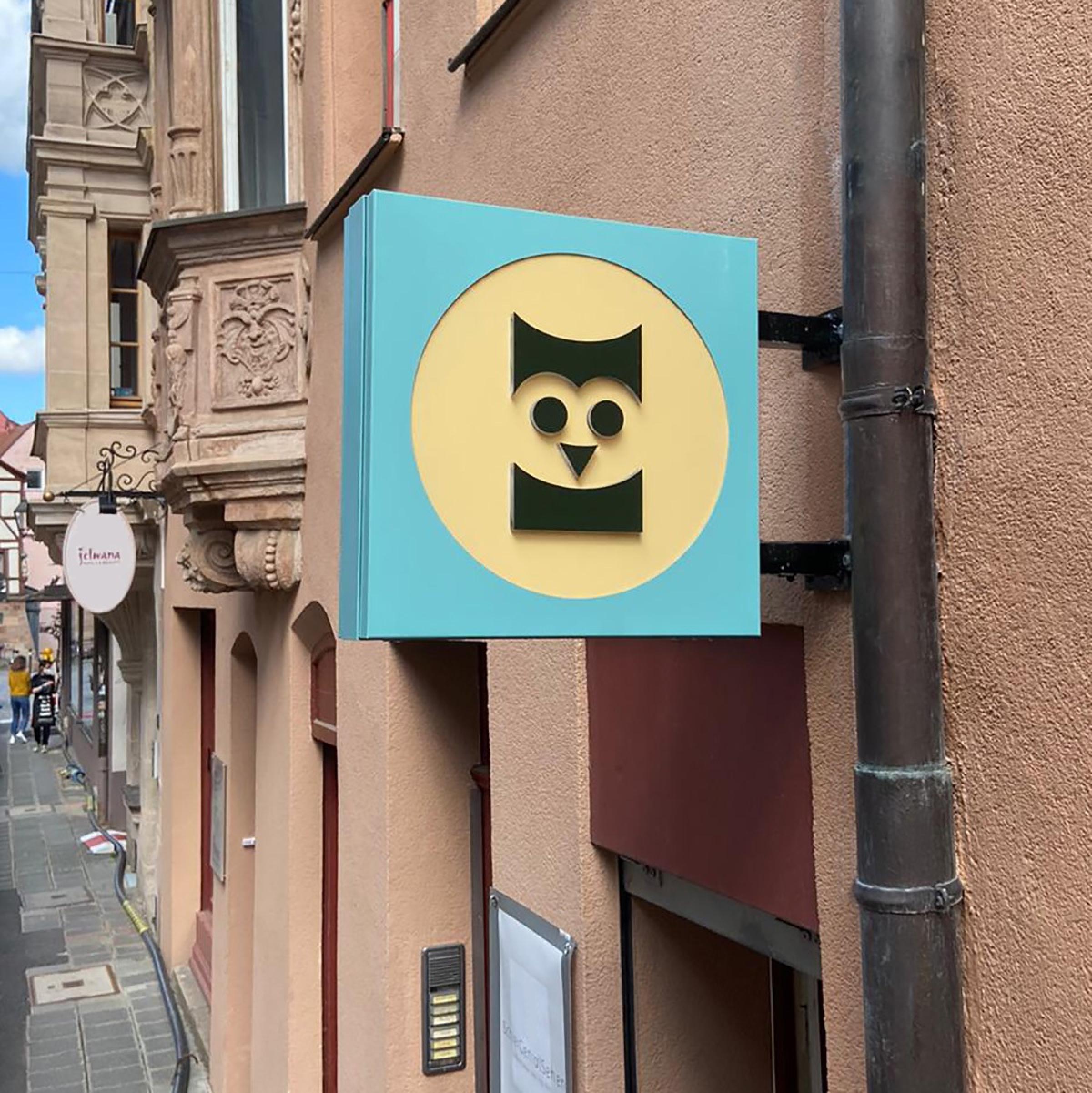
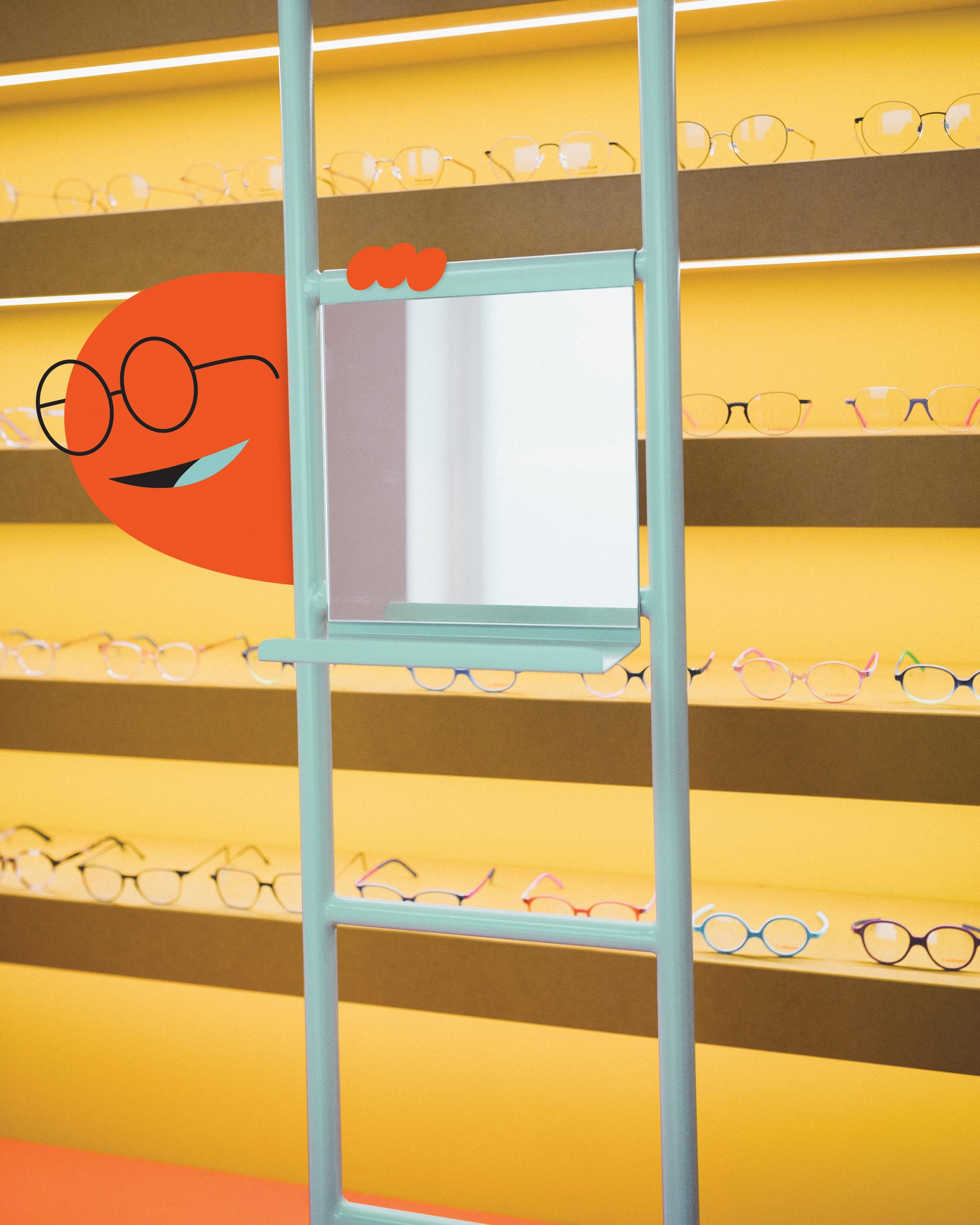
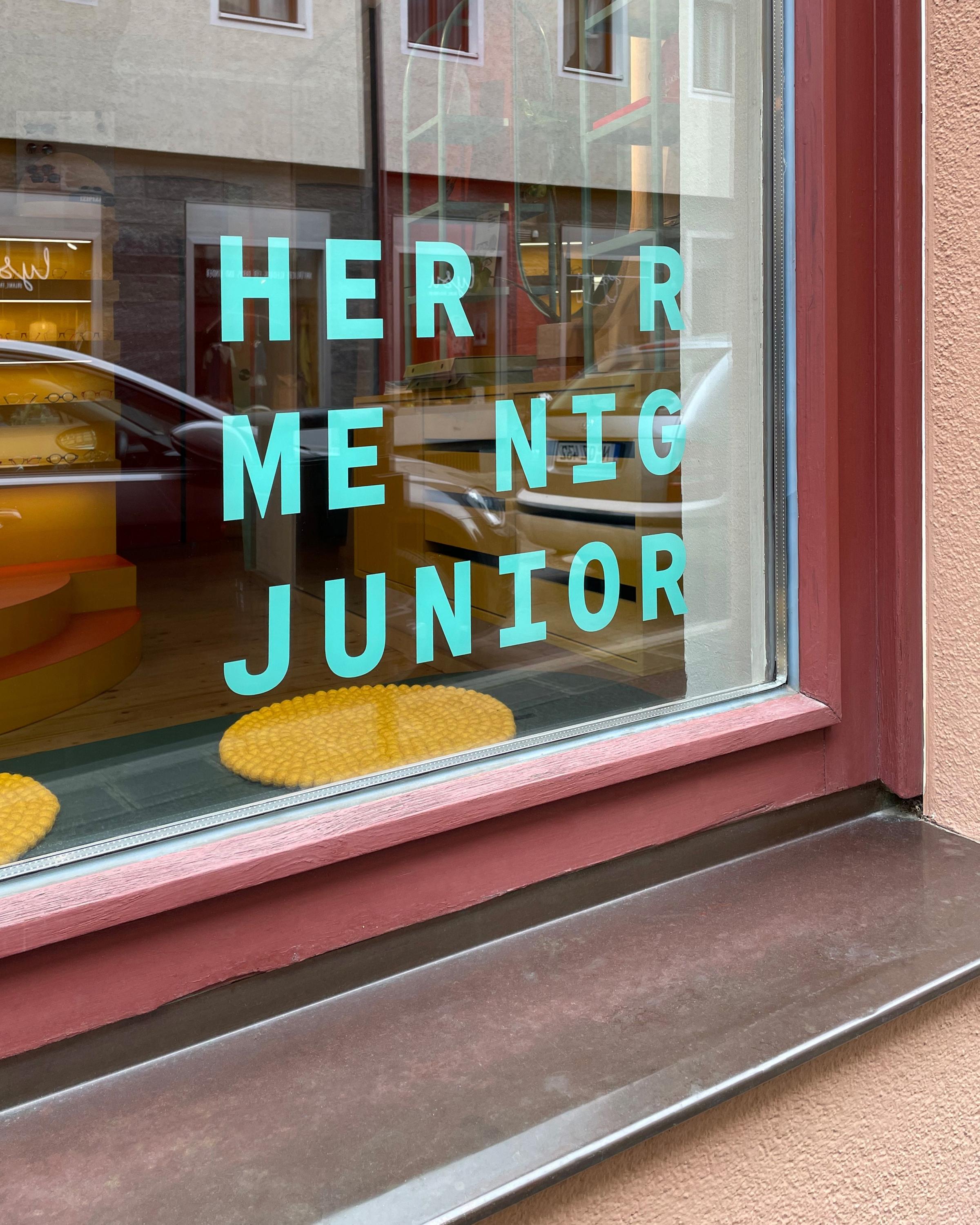
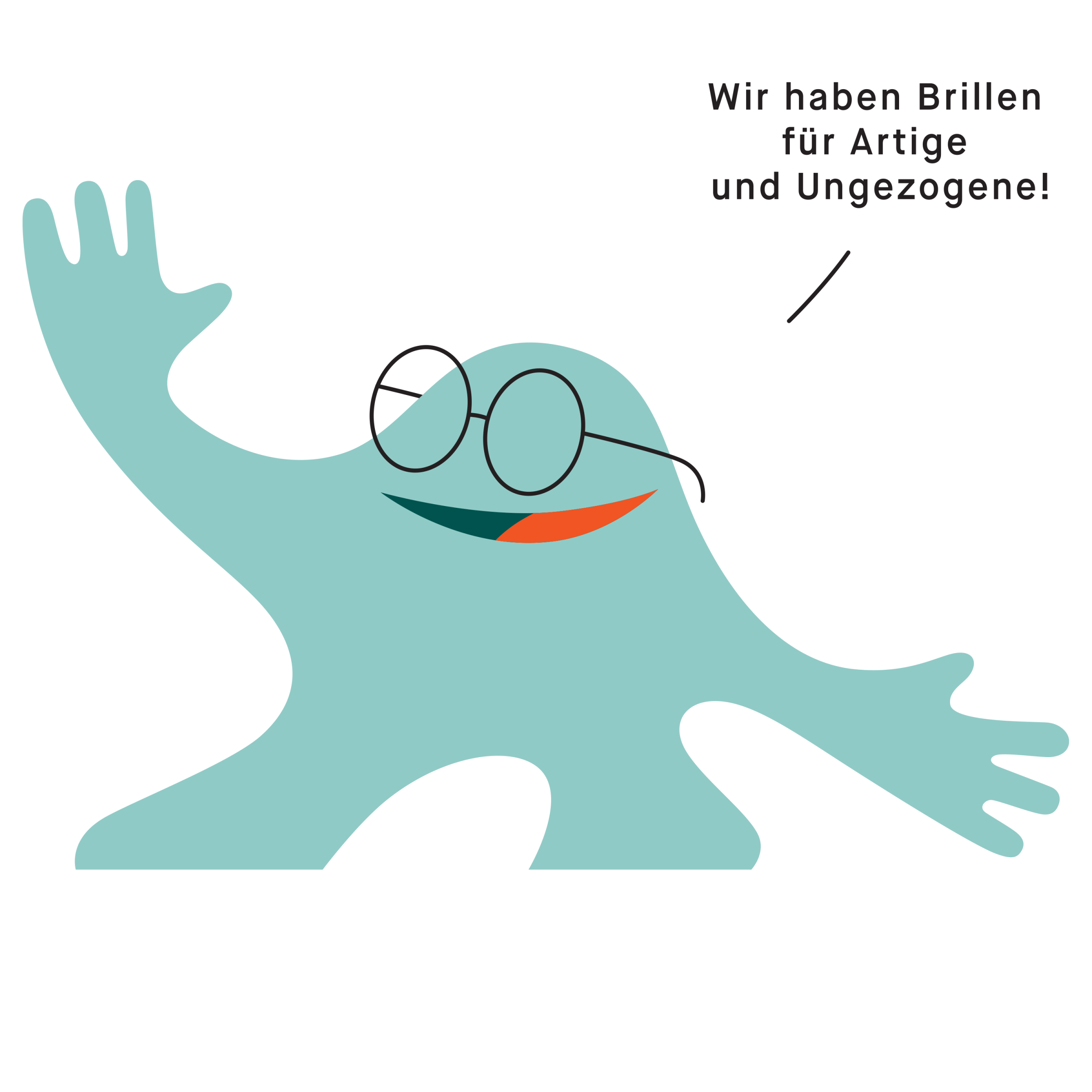
← Silly creature lurking and street signage for the retail shop in Nürnberg’s city center.
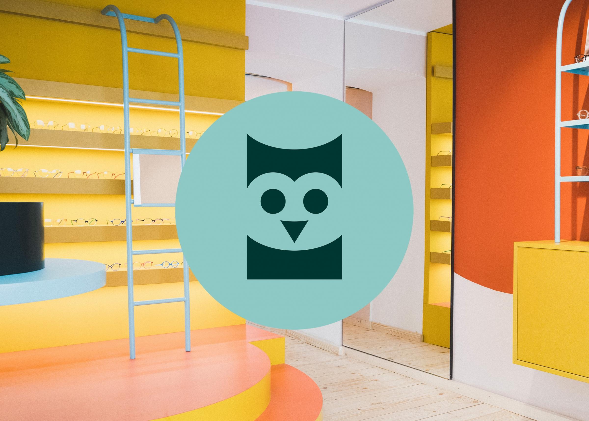
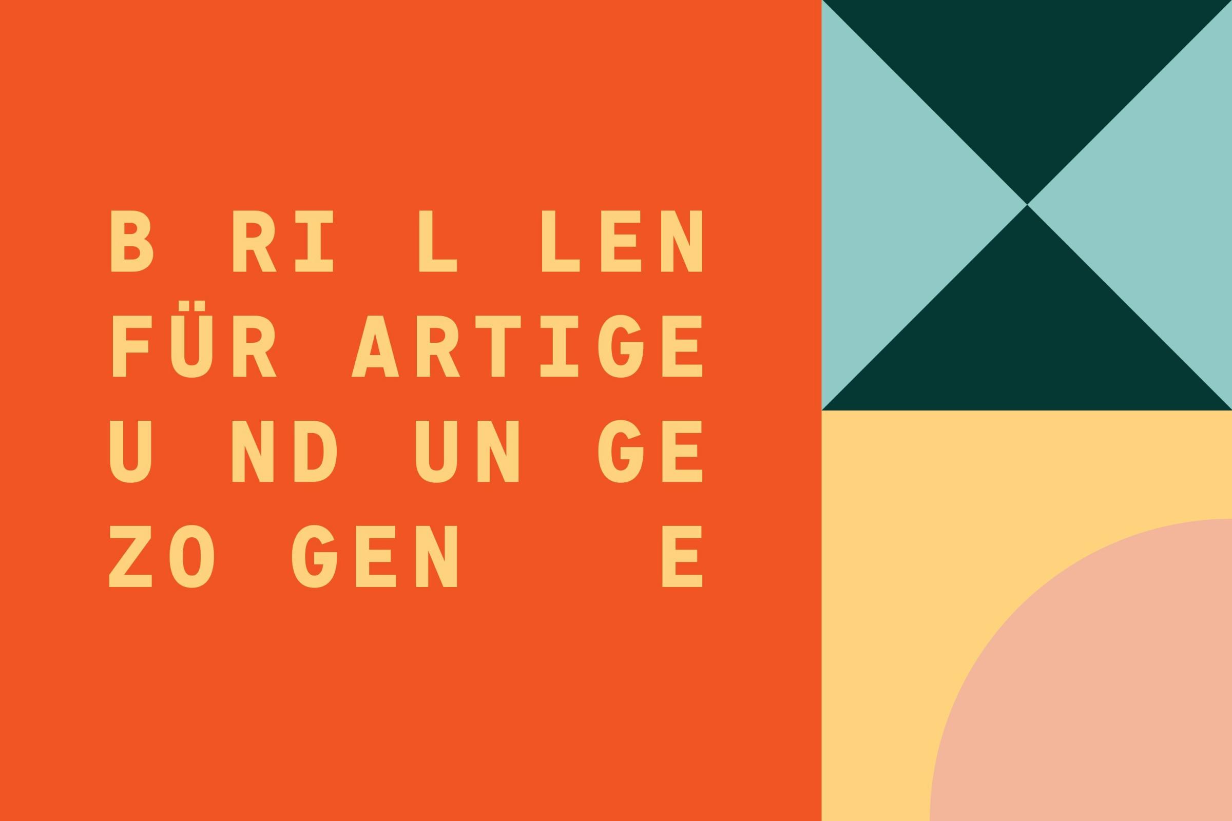
Fun geometric shapes accompany the owl logo on promotional images. →
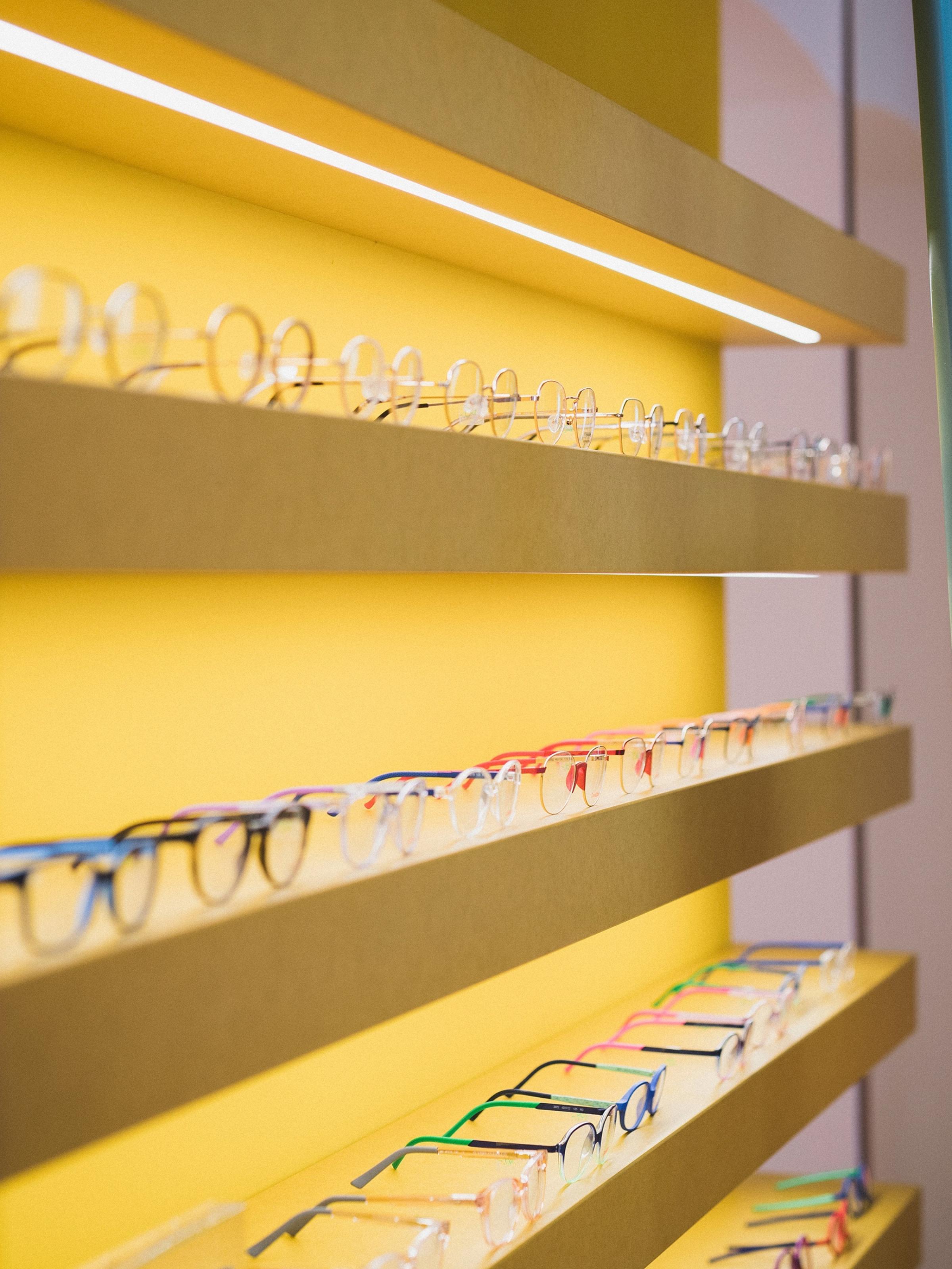
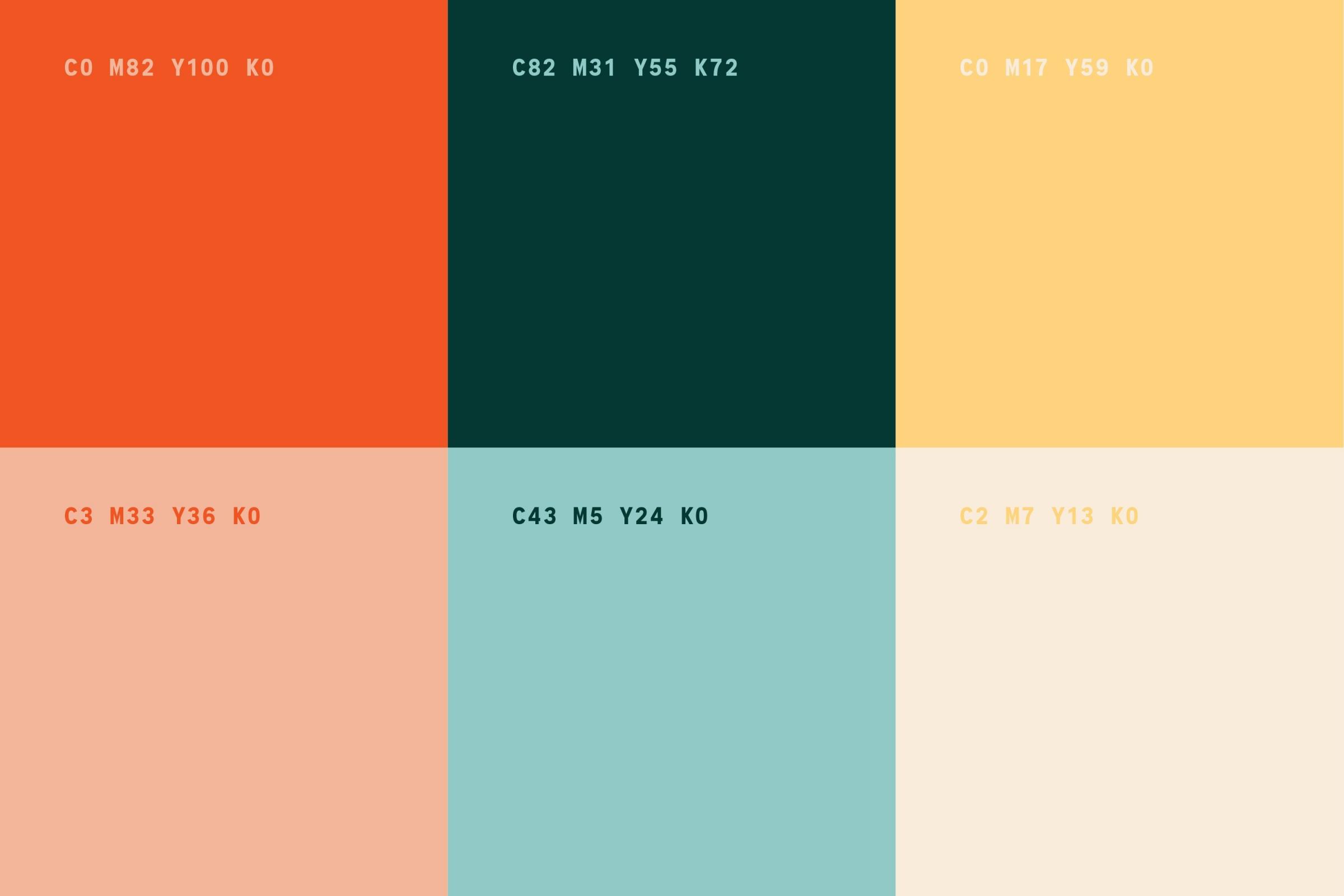
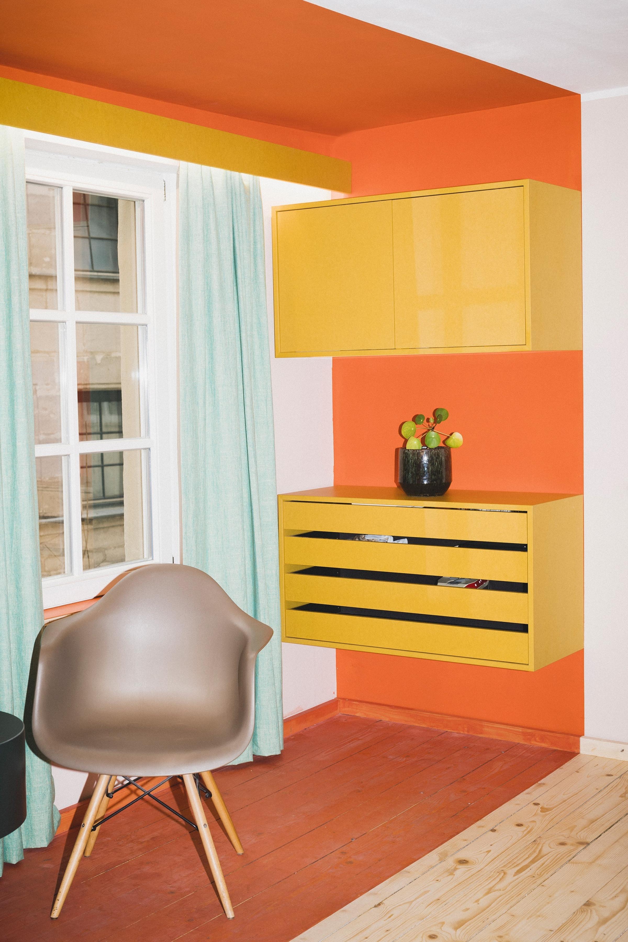
Inspired by classic toys and the storefront of Herr Menig Optik’s main shop, the color palette is friendly and inviting. →
The typographic concept uses the font Signal Mono and borrows its spacing from optometry tests. →
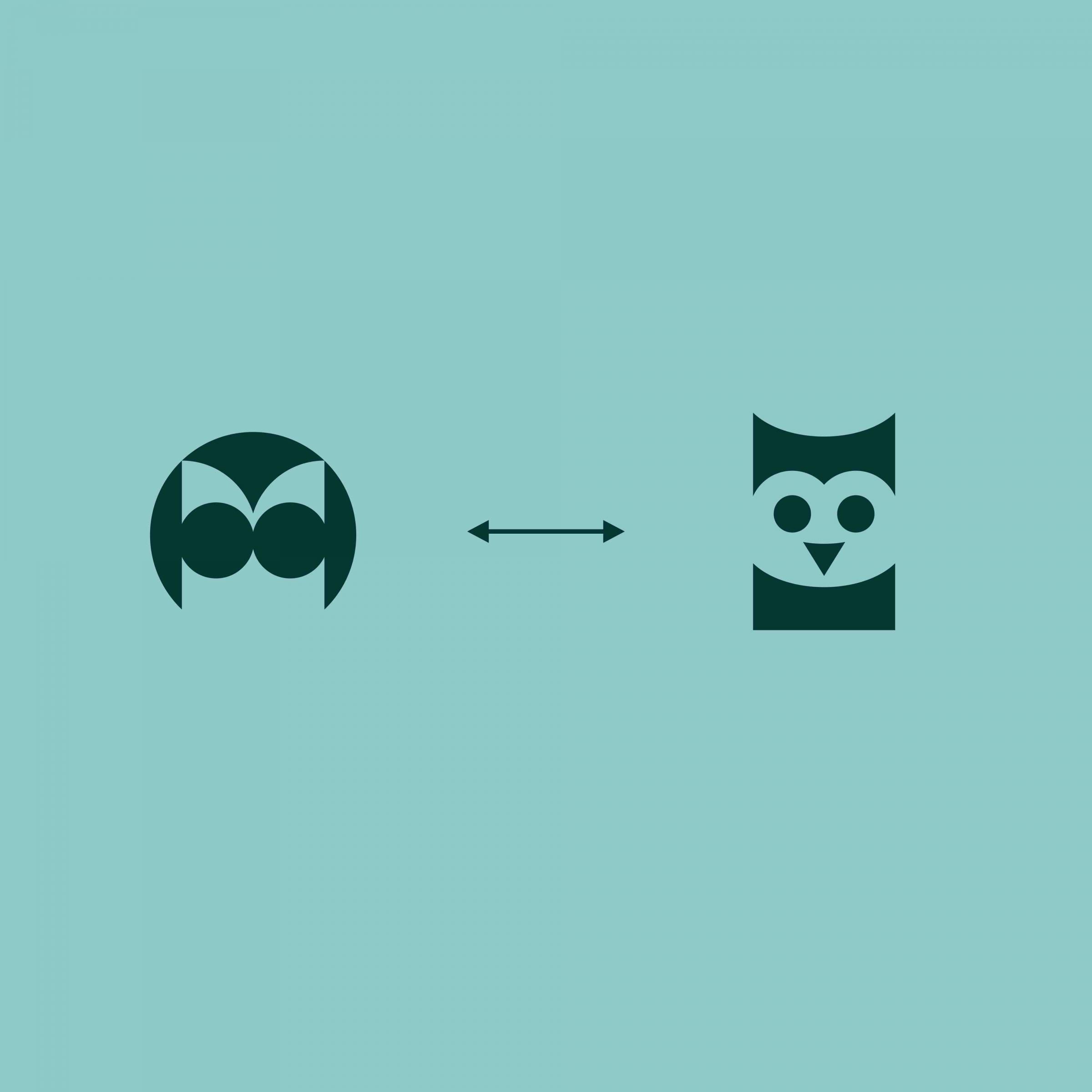
The Herr Menig Junior logo relates to Herr Menig Optik’s initial logo, that is used for the shop for grown-ups. The owl parent had a child! →
← Another weird friend in the store and some window signage.

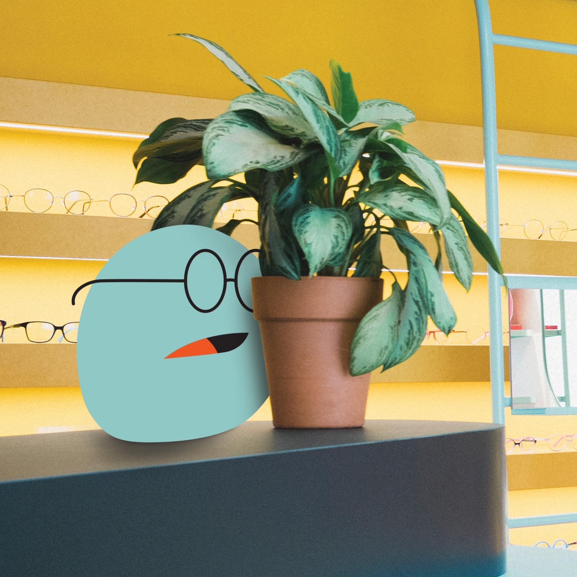
← More patterns and a shy blob.
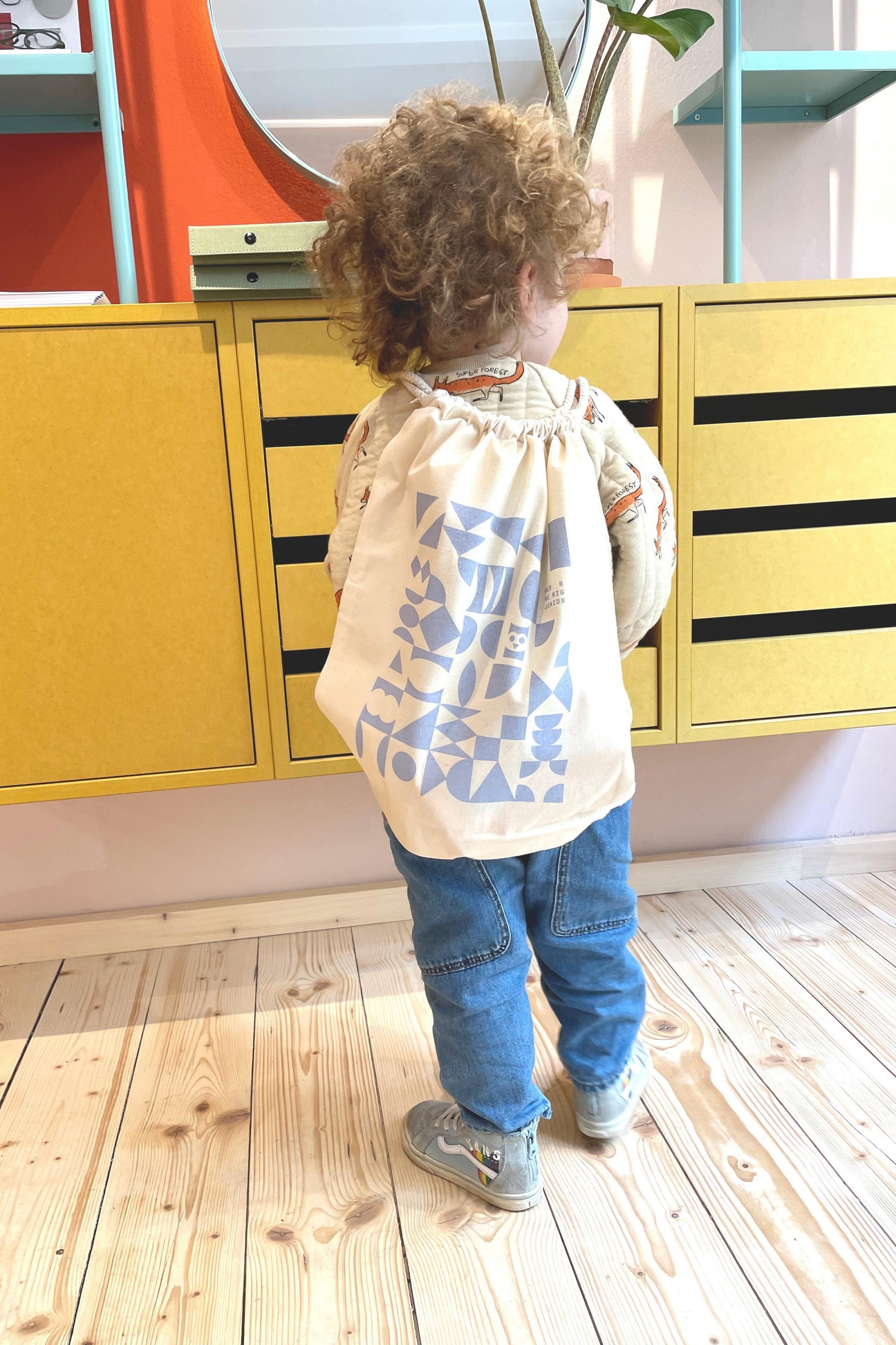
Color application in the shop and a tote bag design worn by a child. →
↓
Herr Menig Junior
Kids Optician Identity
Created in 2021
↓
Client: Herr Menig Optik
Creative Direction & Illustration: Philipp Zurmöhle
Retail Store Photography:
Maria Bayer
Retail Interior Design:
Raum Klaue
↓
View project on:
Communication Arts
Design Made in Germany
Behance