
Lokal Beer
Brand Identity & Packaging Design
Graphic identity, packaging and logo design for Lokal Beer from Toronto, Canada.
Lokal Beer is focused on brewing and celebrating traditional German style beers, using fresh (lokal) ingredients.
The river running through the city – in this case the Rhine in Düsseldorf – is shown on the can in a simplified way.
The logo symbol combines the two L’s from the name while pointing backward to brewing tradition and forward to brewing innovation.
At the same time it marks the spot of the featured location. →
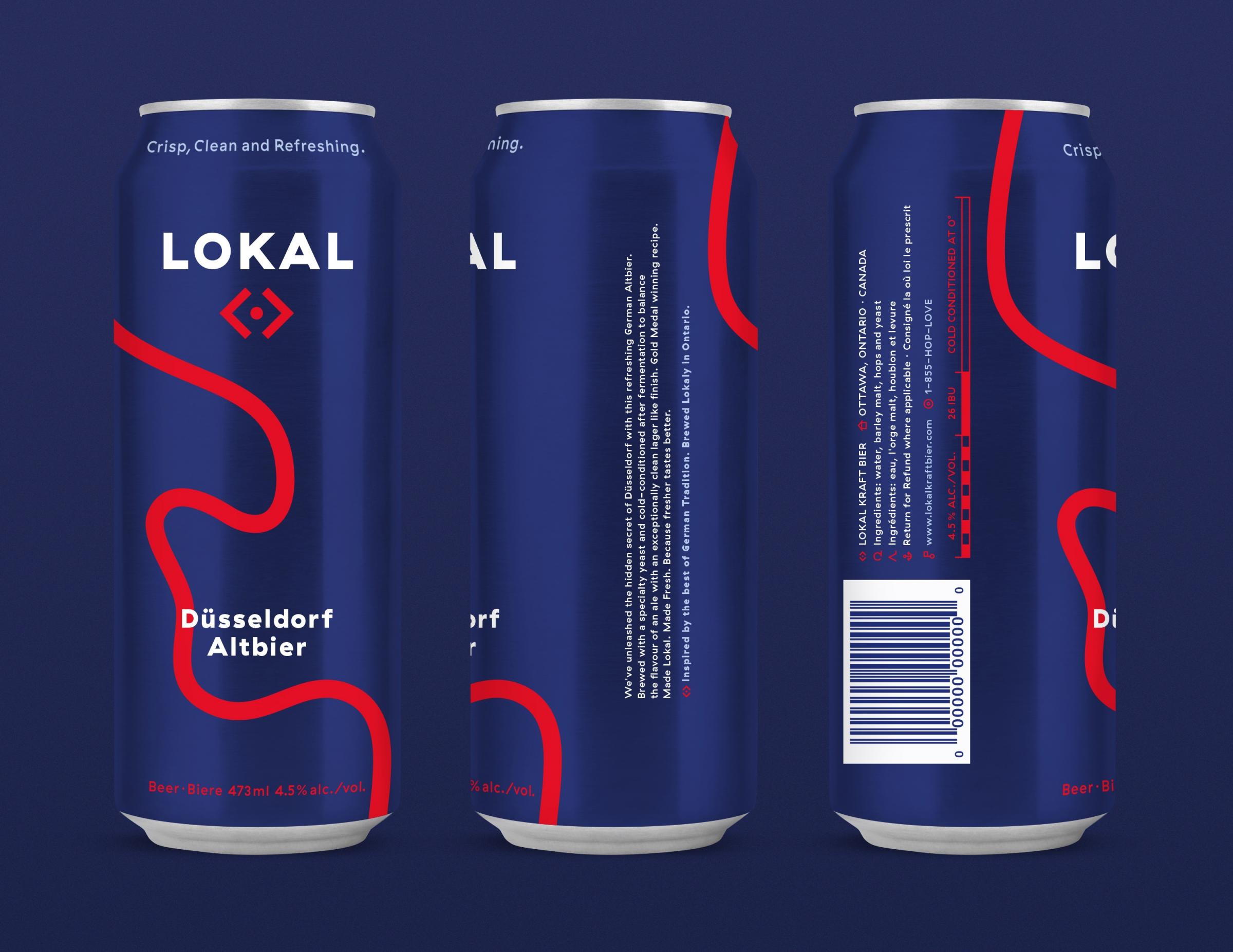

← Inspired by the brand name the design draws from simple and bold map graphics and is referring to typical German informational “Autobahn” aesthetics.
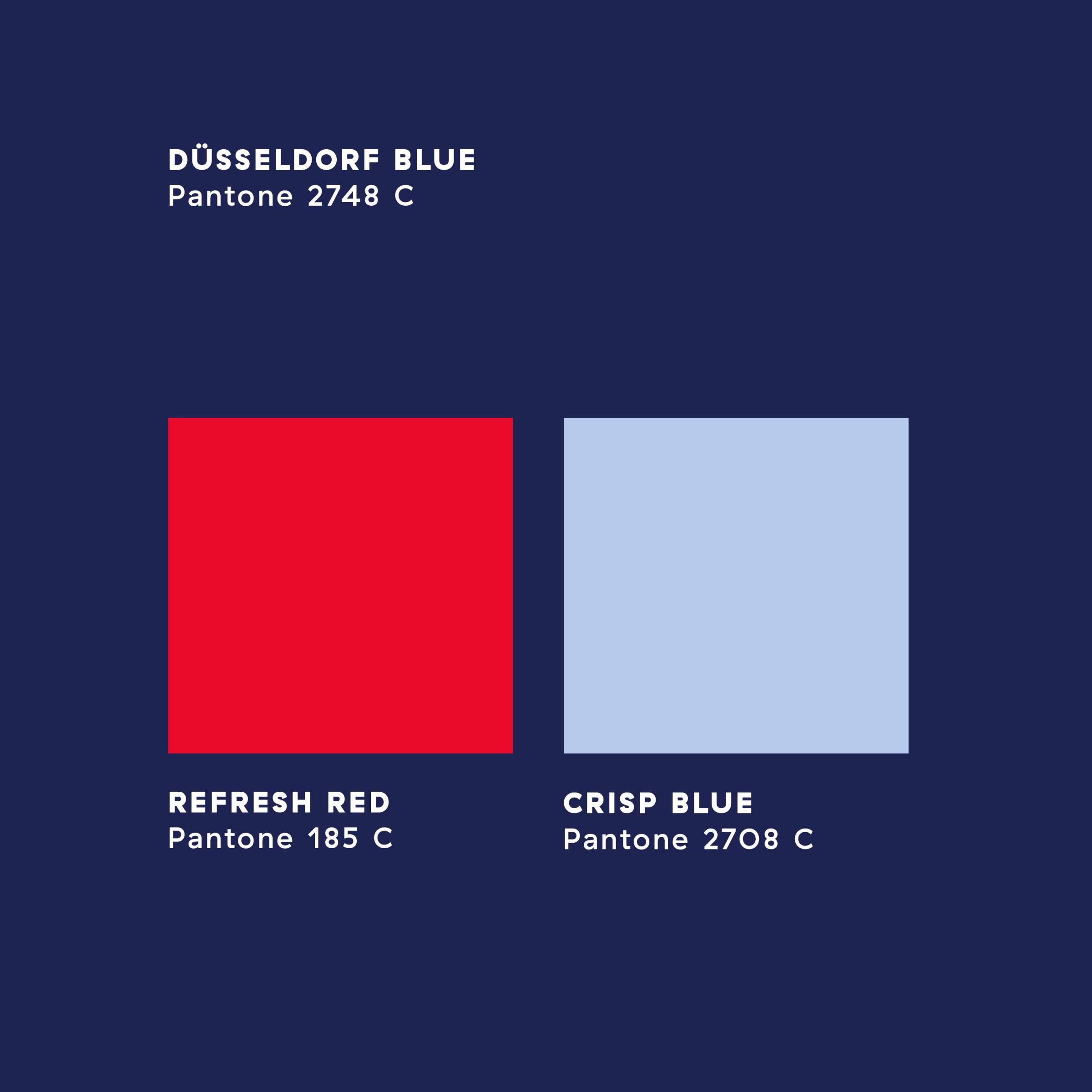
← The colours draw from each cities crest colors underlining the heritage of the beer style.
While being very clean and straight-forward the chosen typeface “GT Haptik” has interesting characteristics.
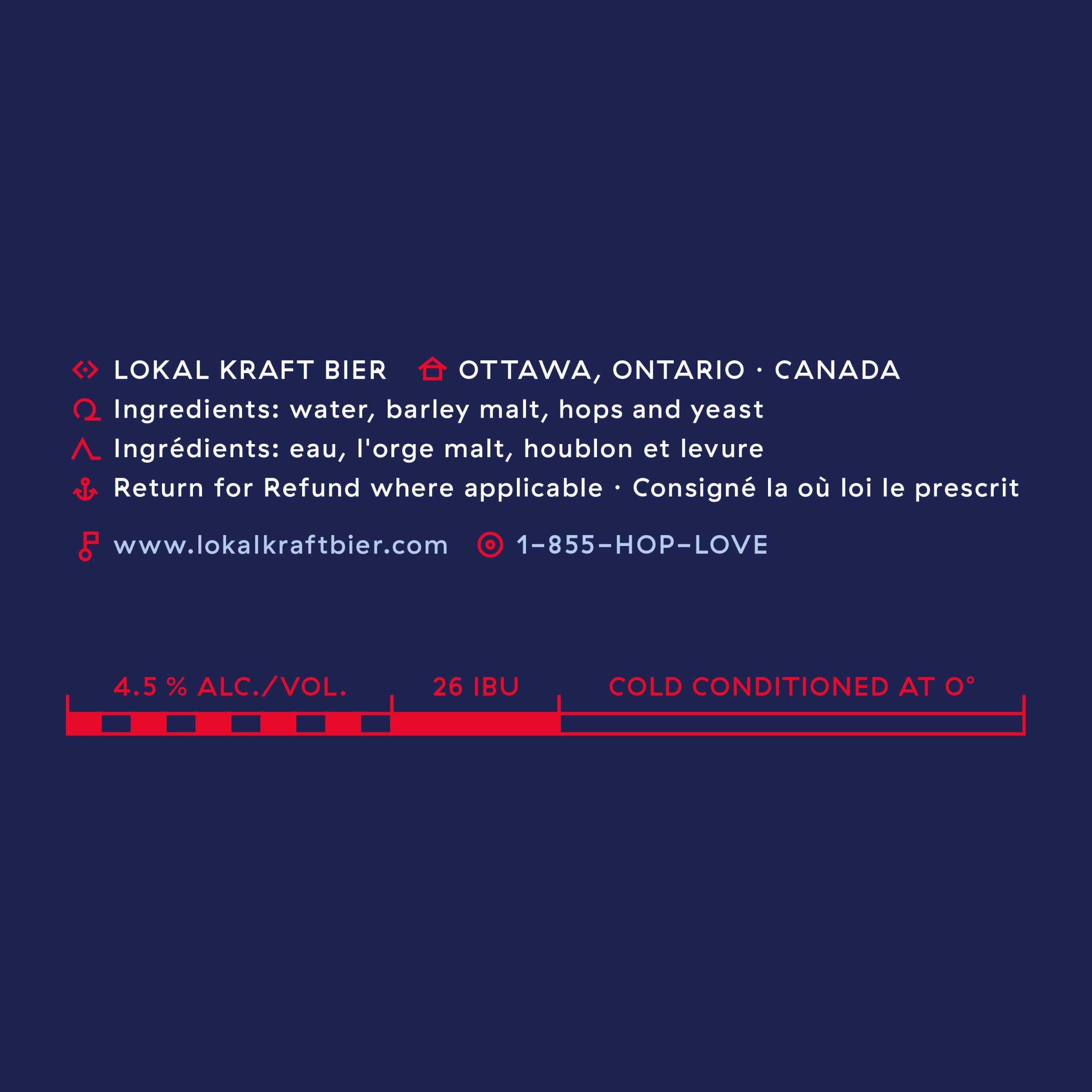
← The icons used for highlighting information on the Lokal Beer can are resembling map symbols to round off the navigational concept.
↓
Lokal Beer
Brand Identity & Packaging Design
Created in 2019
↓
Client: United Craft
Art Direction & Design: Philipp Zurmöhle
↓
View project on:
Behance