Maka Macadamia Butter
Brand Identity & Packaging Design
Maka is offering the most delicious macadamia nut butter with all natural ingredients.
Made in Hawaii it includes all kinds of island vibes and of course a big portion of sunshine.
Transatlantika created a characteristically colorful brand identity including naming, logo and packaging designs.
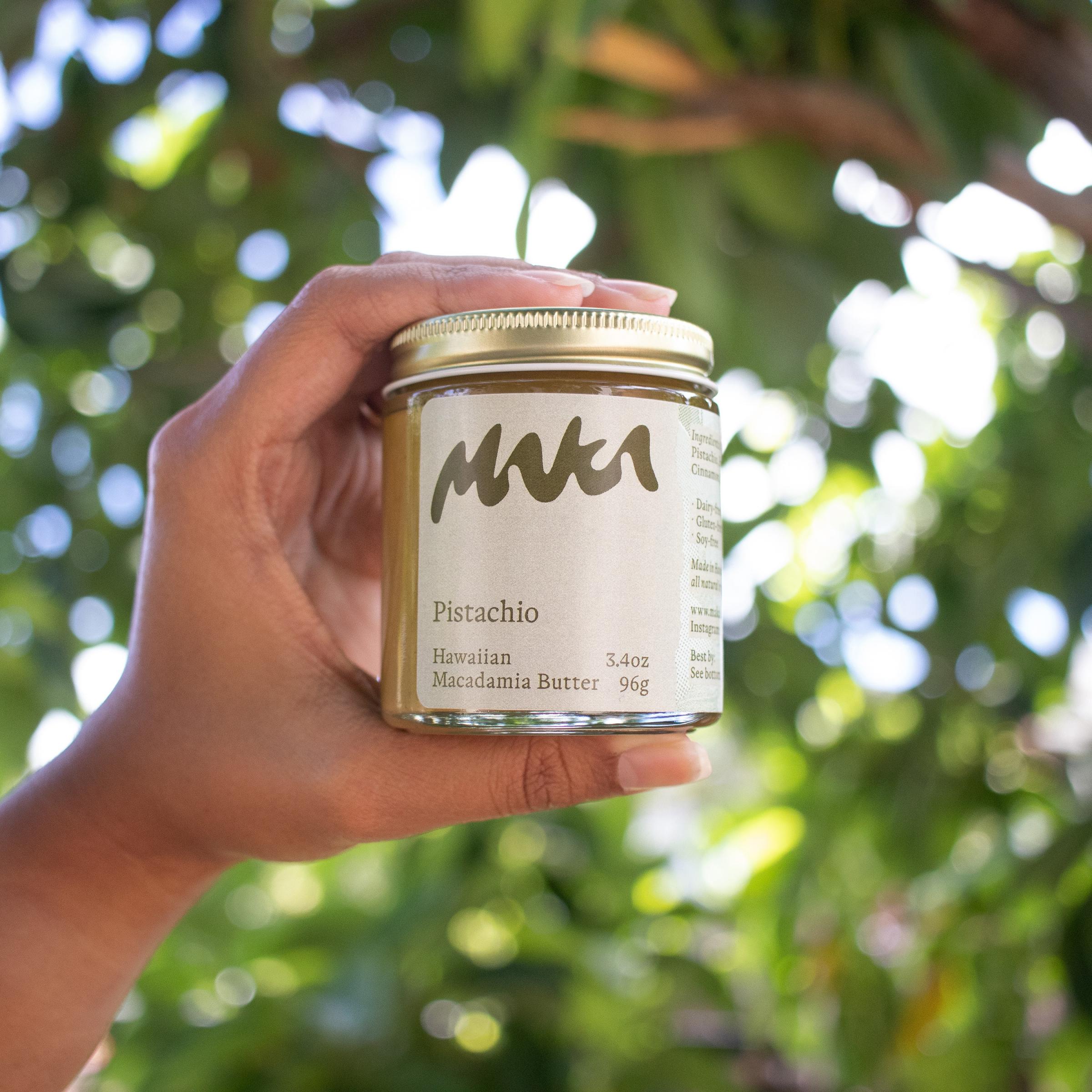
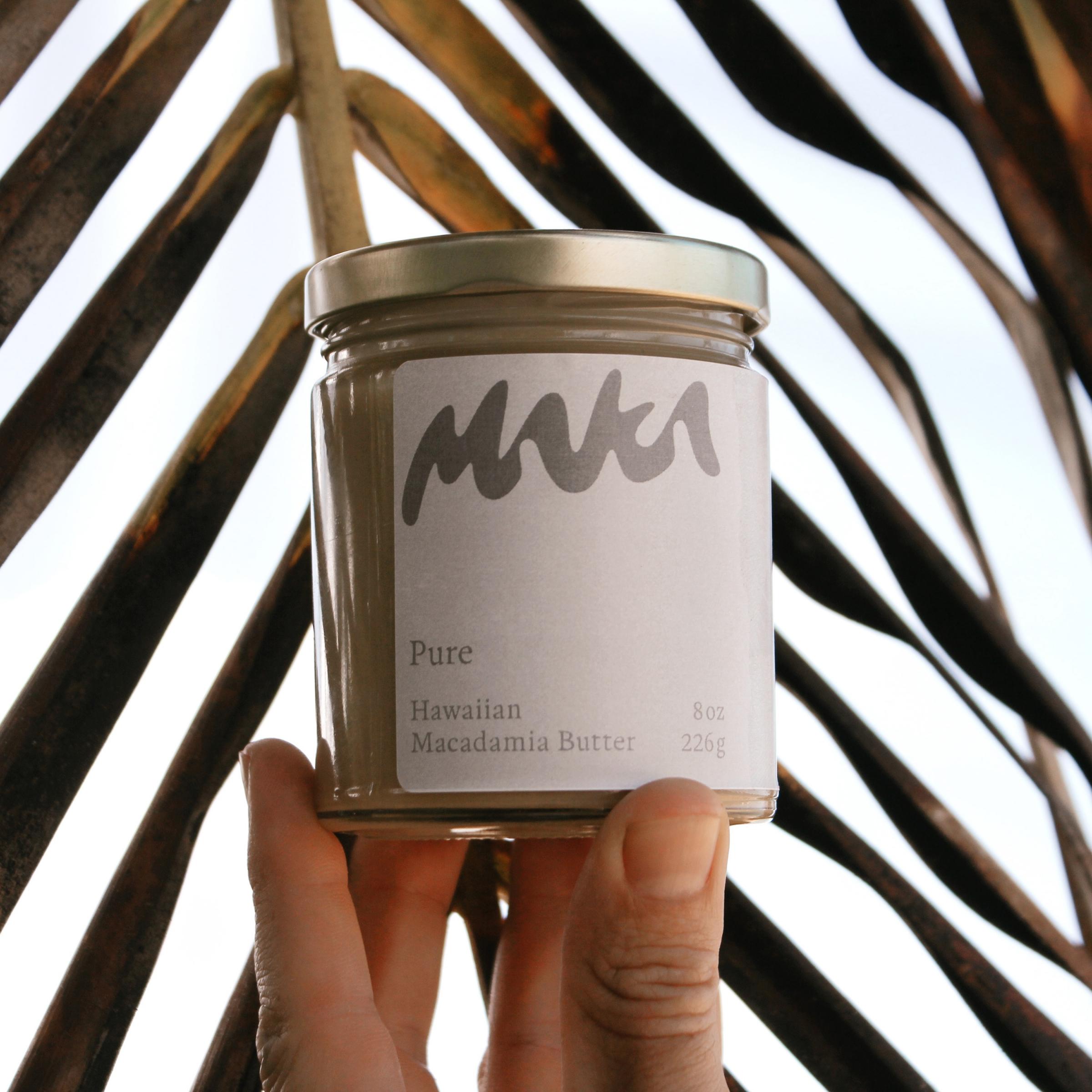
The logo design first and foremost expresses the creamy consistency of the macadamia nut butters.
Unique and bold, it works as a strong brand defining element.
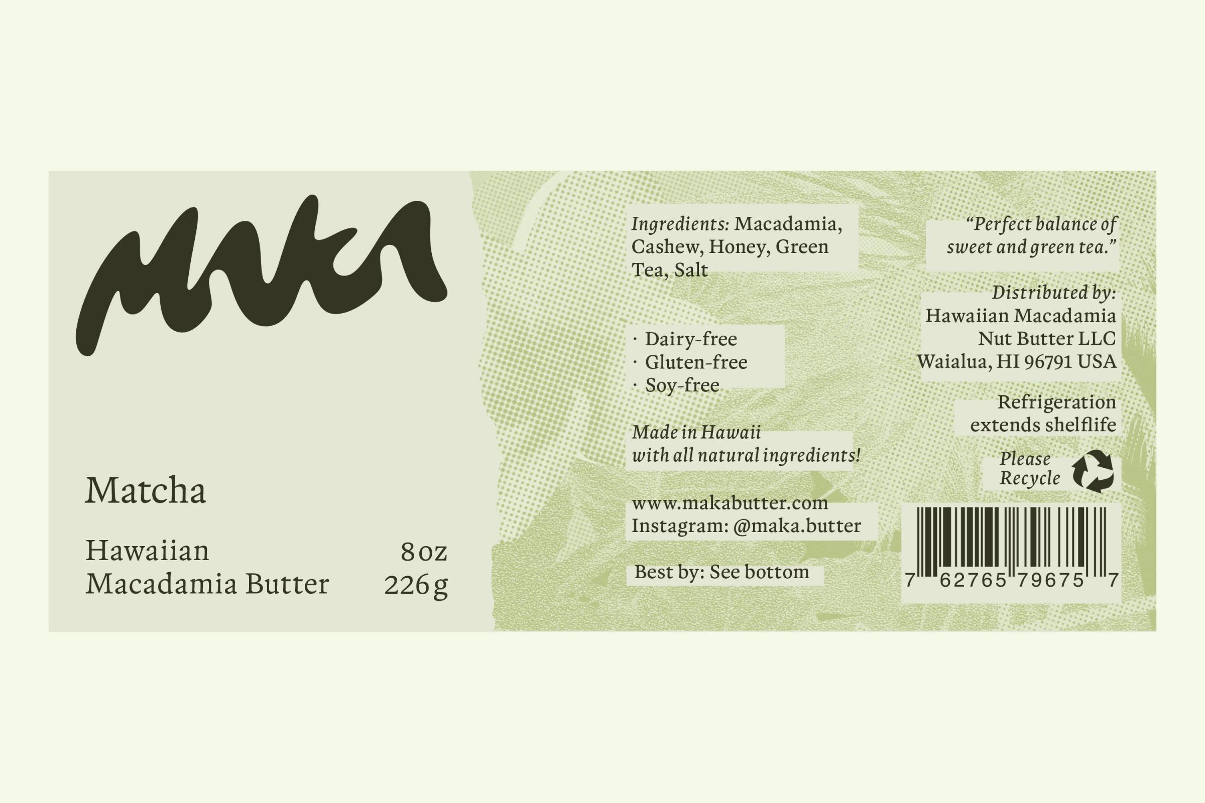
A bespoke tropical collage pattern serves as a lively backdrop. →
“Transatlantika has been so professional and friendly when designing the labels and logo for Maka butter. The new look has given us a great curb appeal for our products.”
– Stuart Meece, Maka Founder
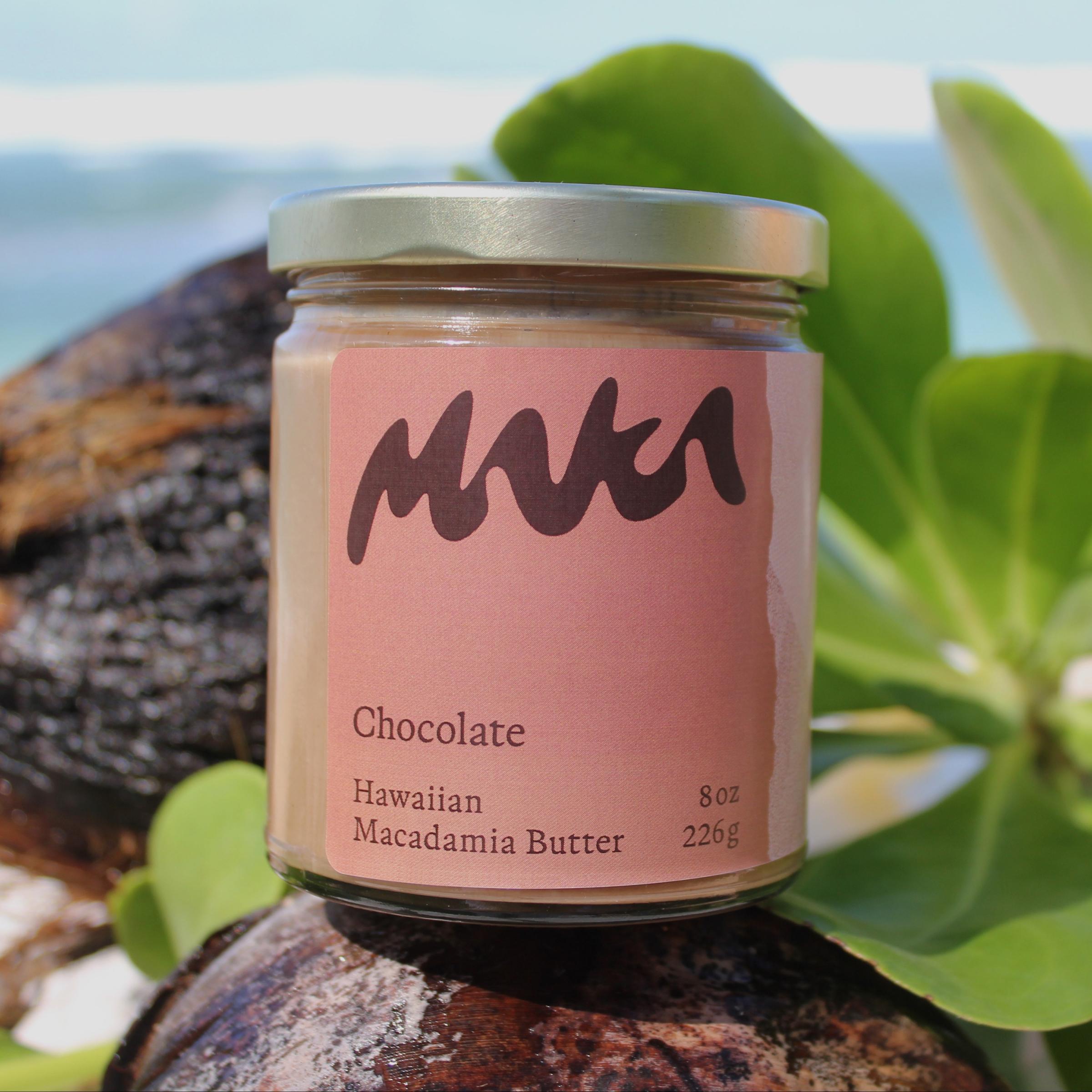

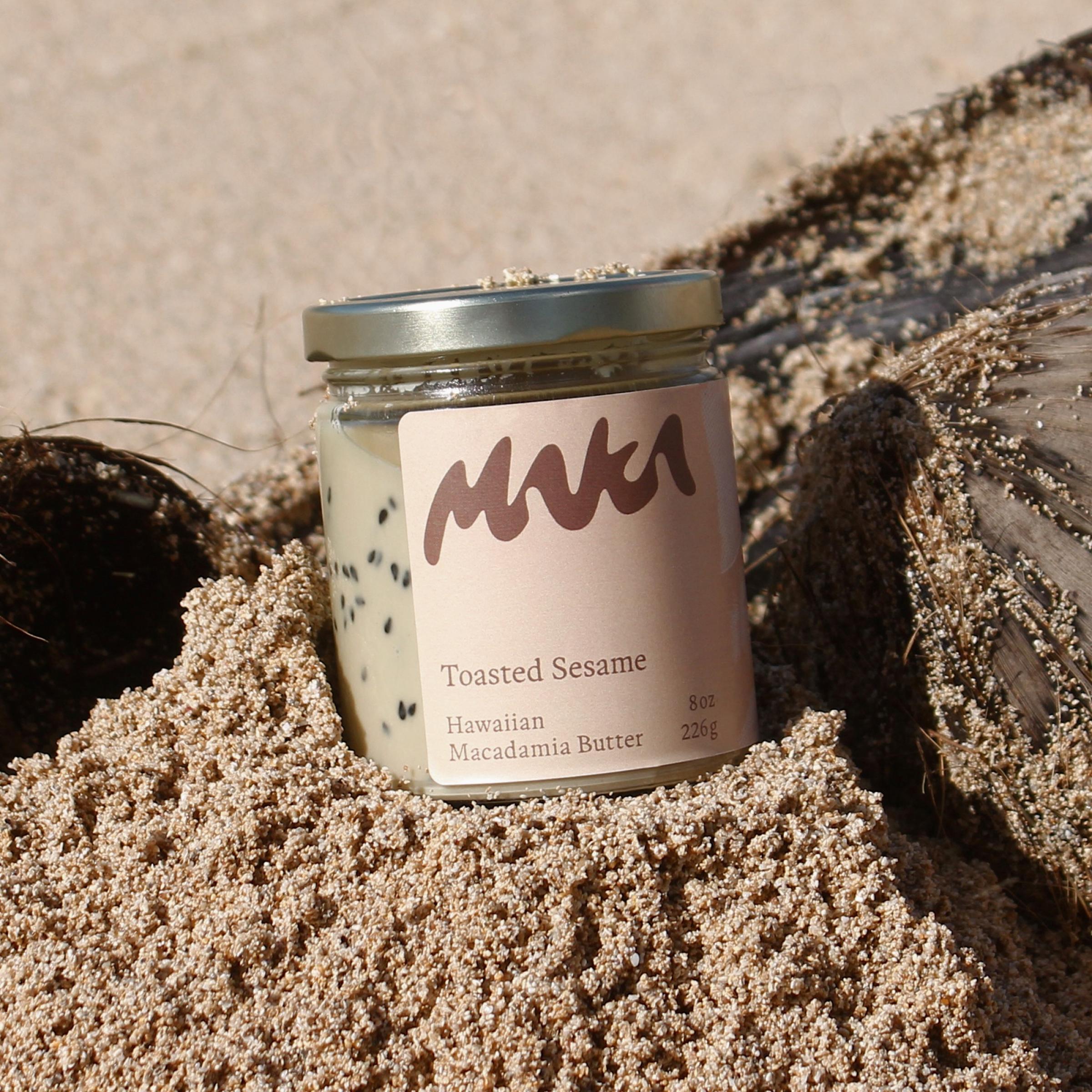
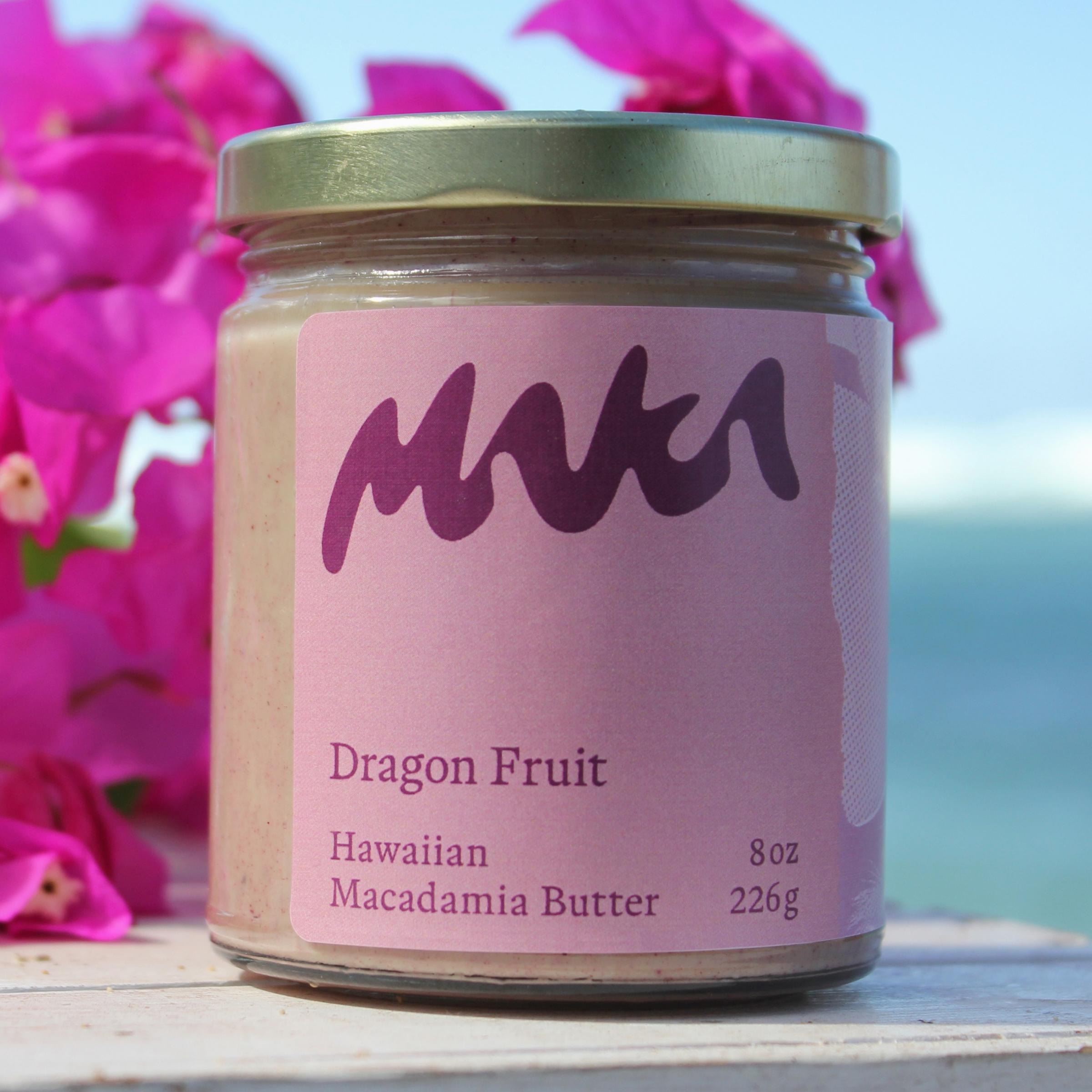
← Each flavor is expressed with a different color combination referencing the respective ingredients.
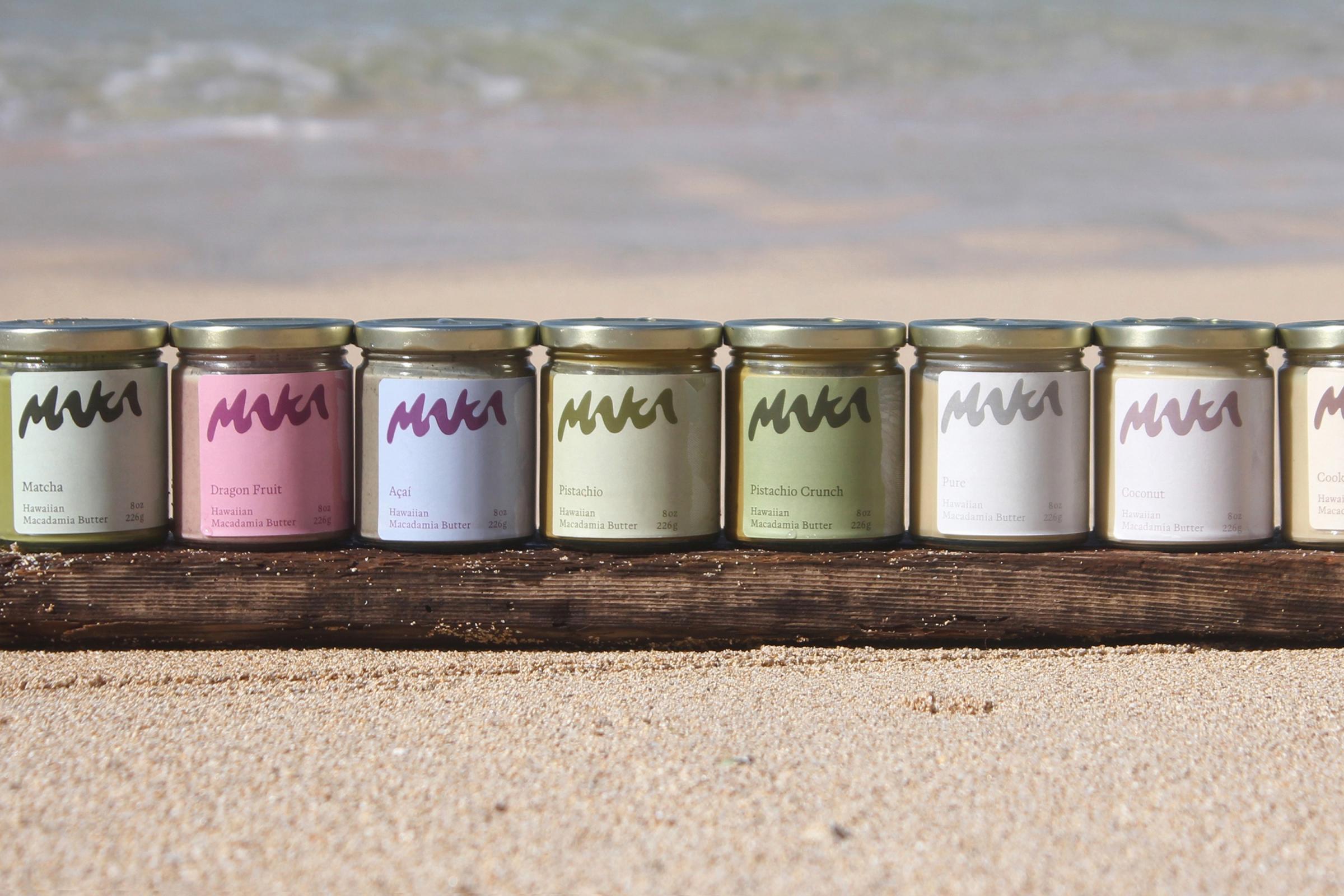
← Maka founder Stuart is presenting the rainbow of products on the beach.
The packaging label layout is straight-forward and easily legible on the front.
The list of ingredients and detailed information around the side have more of a self-made notion and highlight the tropical background of the nut butters. →
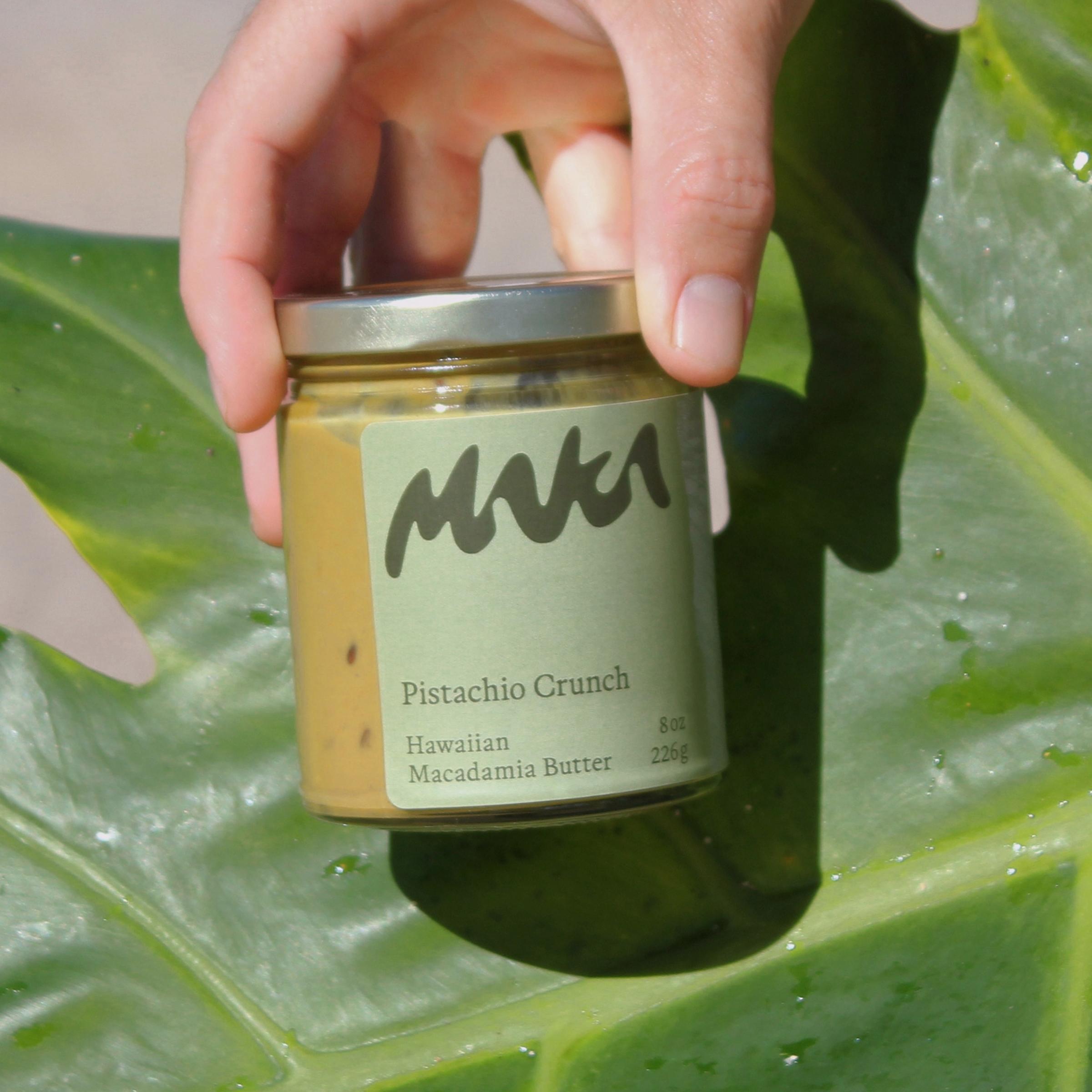
“Pure” and “pistachio crunch” label designs. →
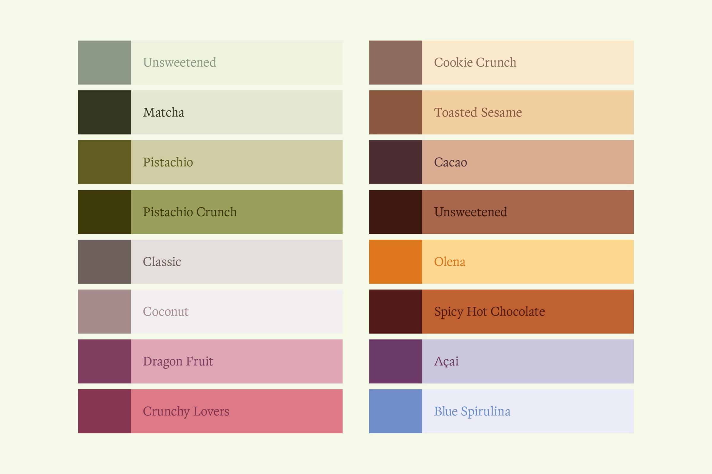
← Earthy tones form the Maka rainbow of a color palette.
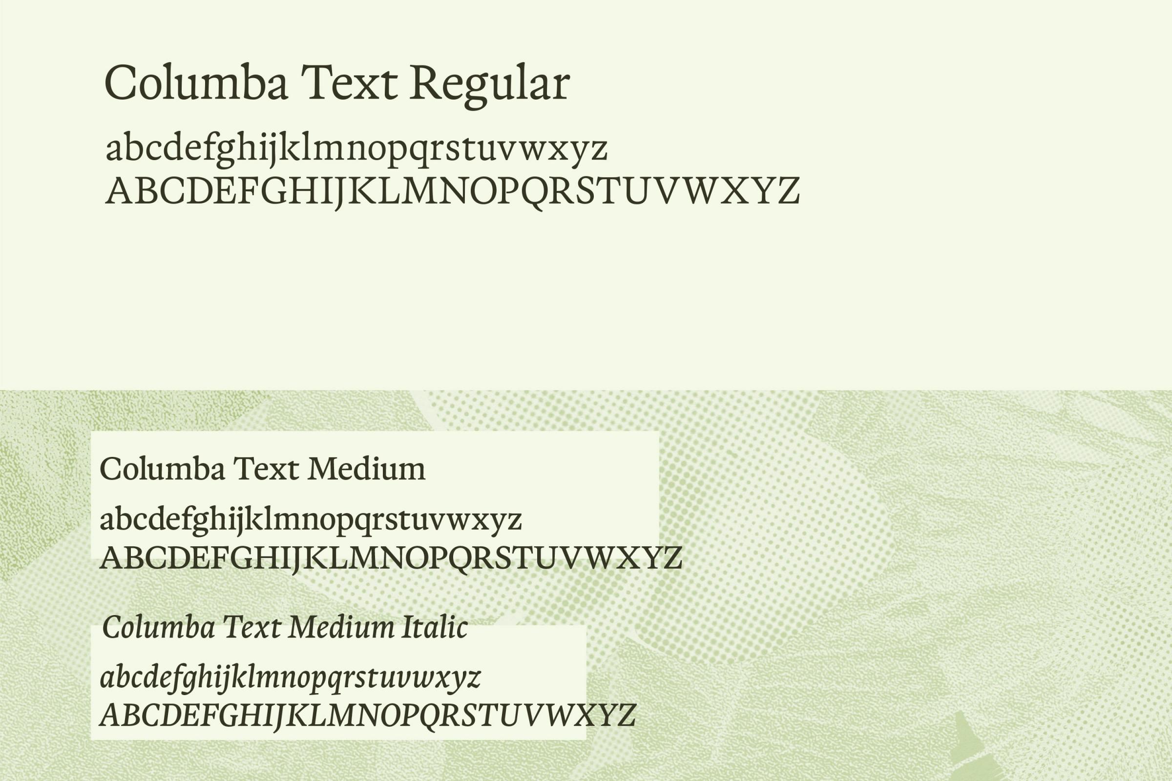
The typeface “Columba Text” is a well-legible and characteristic part of the branding.
If used on top of the tropical illustration, it is set on an intentionally “misplaced” box to underline self-made collage character. →
“Toasted sesame” and “dragon fruit” flavor label designs →
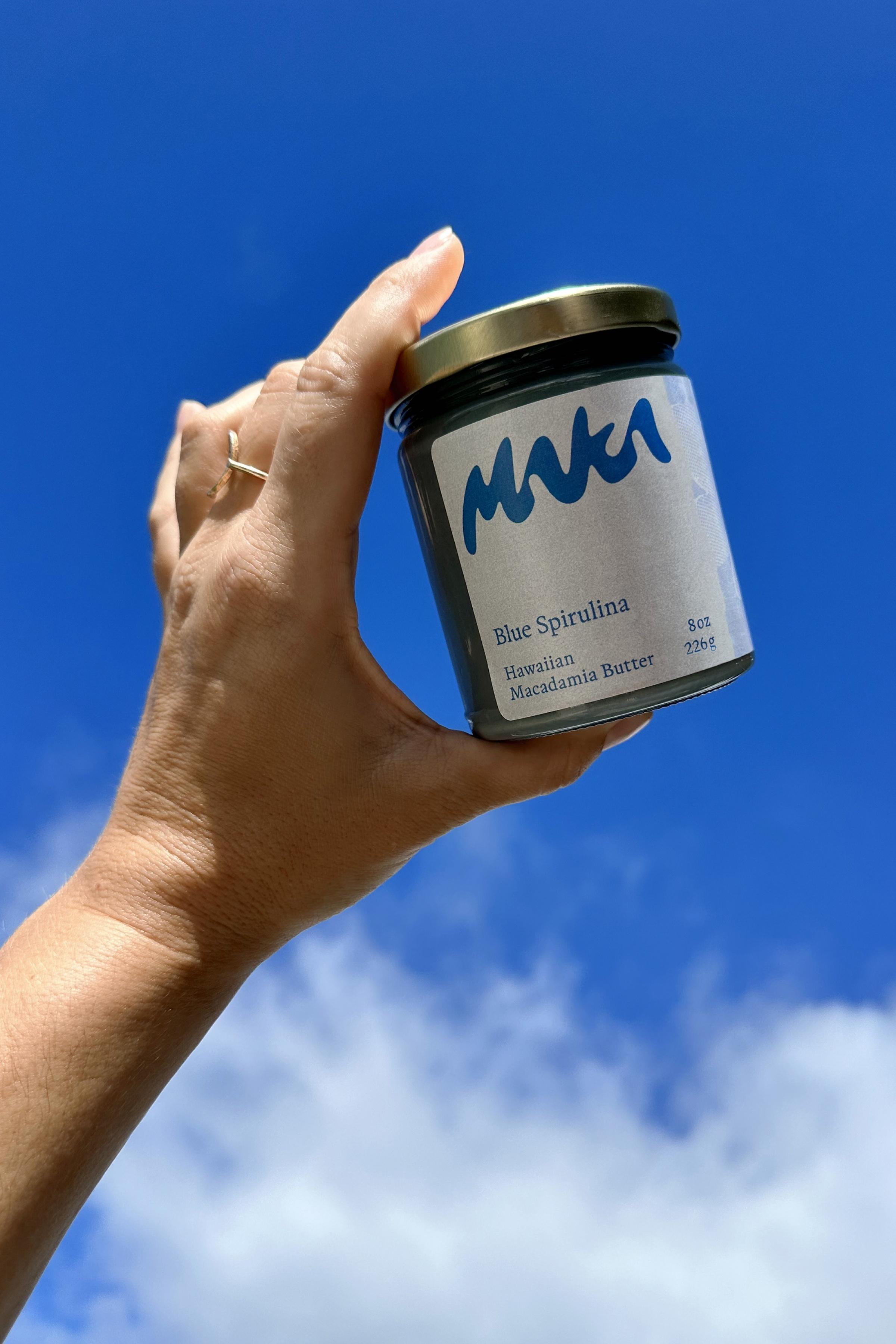
← The label for Maka’s “blue spirulina” flavor is matching Hawaii’s beautiful skies.
↓
Maka Macadamia Butter
Brand Identity & Packaging Design
Created in 2023
↓
Client: Maka
Creative Direction & Design: Transatlantika
Product Photography: Jewelia Orlick / Abigail Joslyn
↓
View project on:
–