
MIA VIA
Brand Identity & Packaging Design
MIA VIA is sourcing fine organic foods only from Italian Demeter certified producers.
Over 50 products were carefully selected including olive oils, tomato sauces, pesti, honeys, wines and more.
In collaboration with Picpacker Motion Design Transatlantika created the brand identity including name, logo, packaging, illustrations and a modular color concept to build a brand that is bold and elegant while subtly hinting at the company’s Italian origin.
← The MIA VIA name (meaning „my way“ in Italian) and logo is inspired by old roman milestones. The typeface Garda Nova is based on the ancient Capitalis Monumentalis.
While the font has luxurious classic Italian feel, the generous letter spacing gives the logotype a touch of modernity.
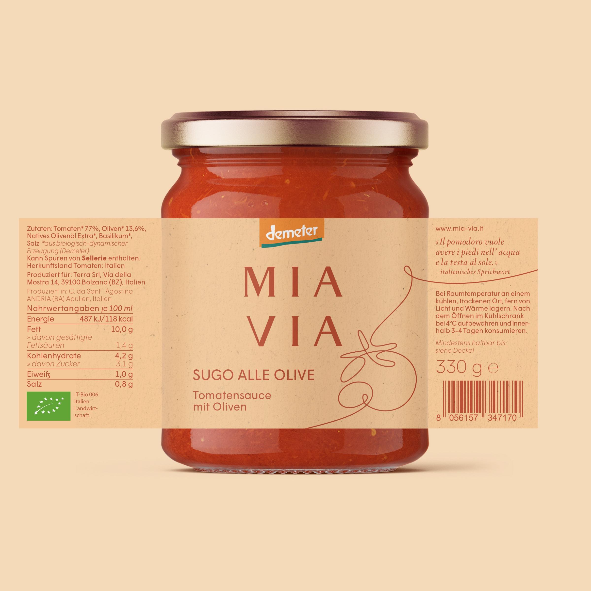
On the product packaging one-liner illustrations of ingredients and characteristic Italian scenes convey the imaginary path traveled (MIA VIA translates to “my way”). →

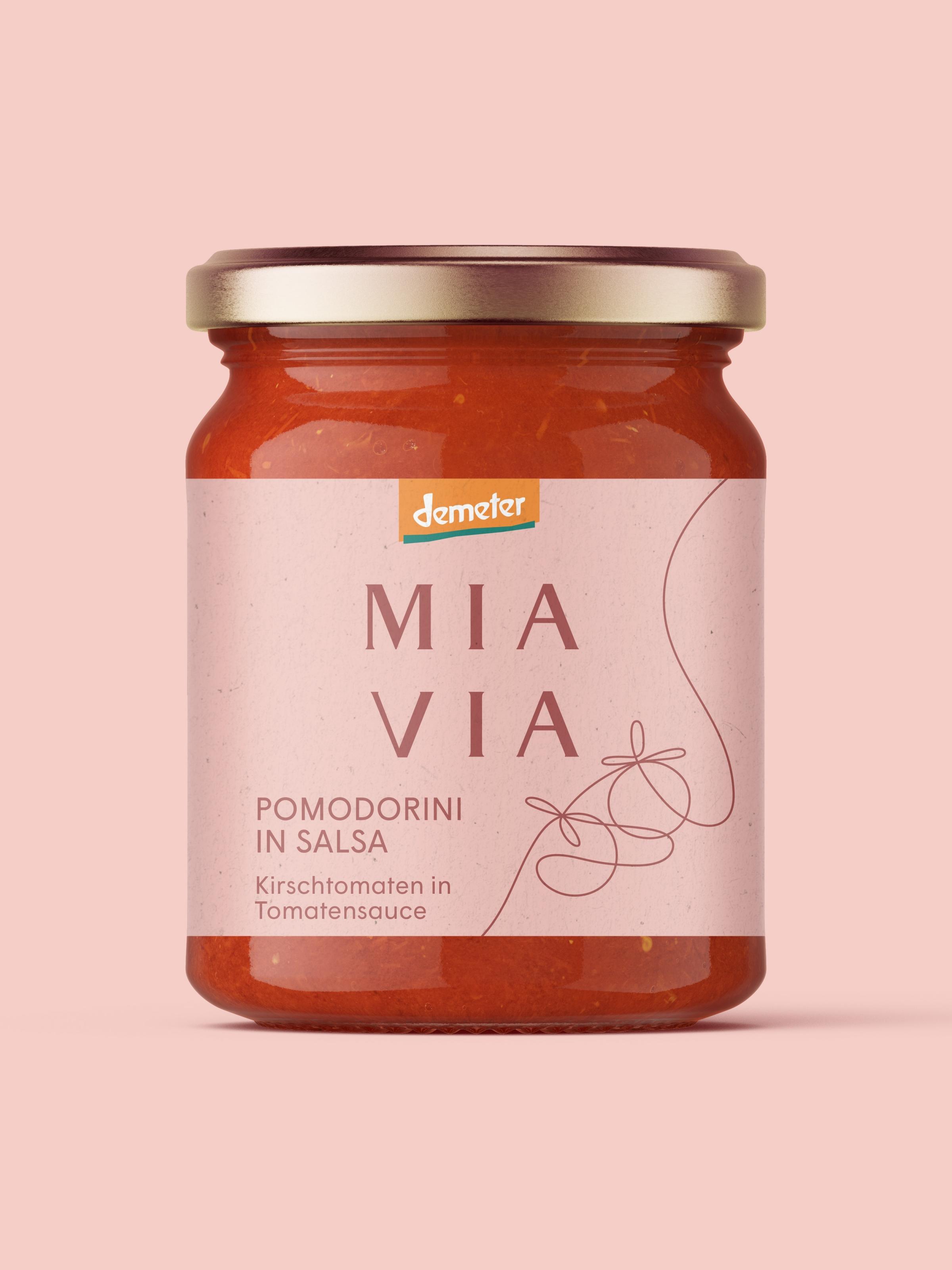

← “Pomodorini in Salsa” tomato sauce packaging design and “Polpa di Pomodoro” one-liner illustration.
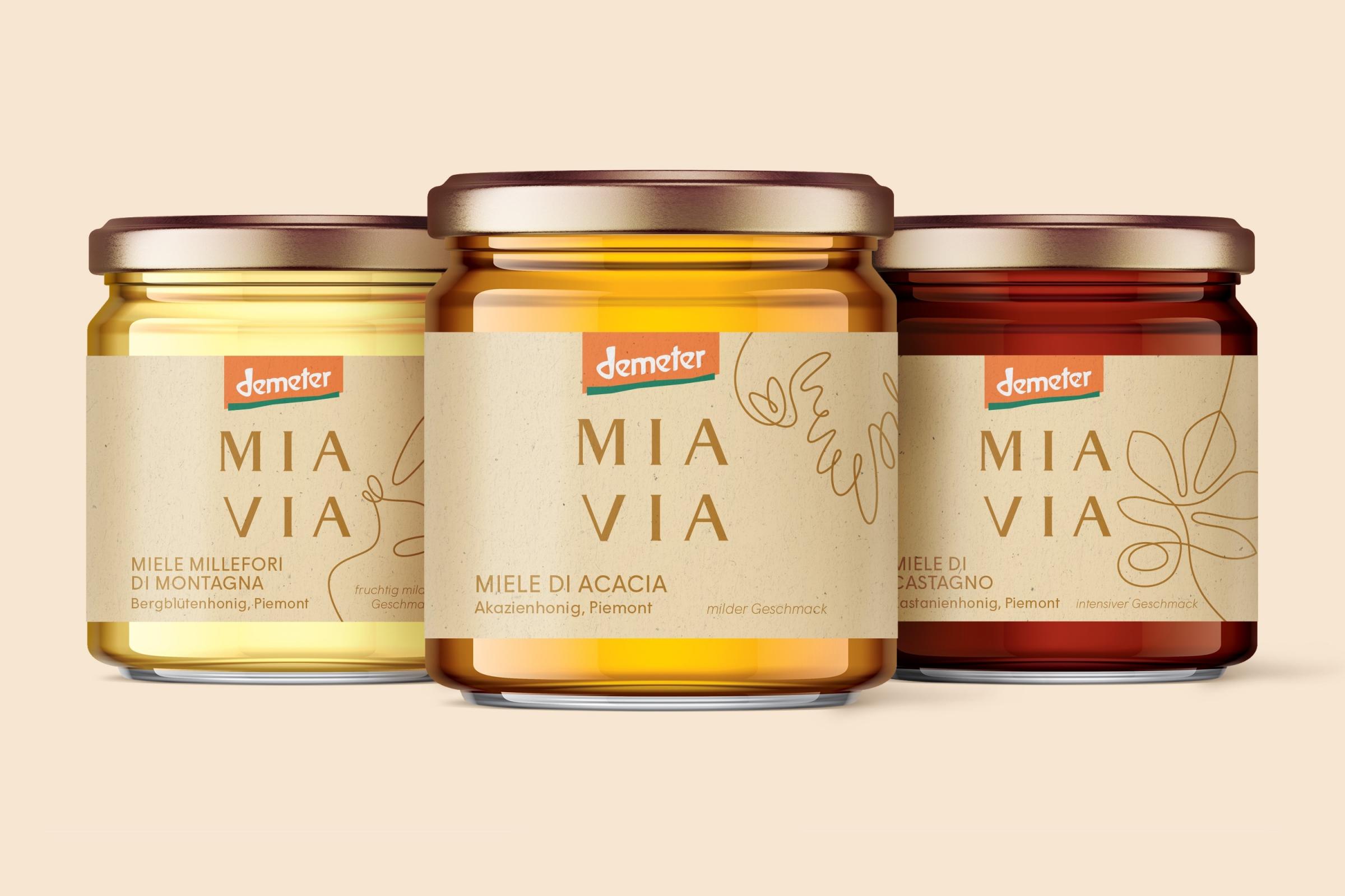
Different honey flavours with their themed illustrations. →
The MIA VIA monogram symbol accompanies the logotype and combines the letters M and V from the brand name.
The slogan translates to “Find your way to the flavours of Italy.” →


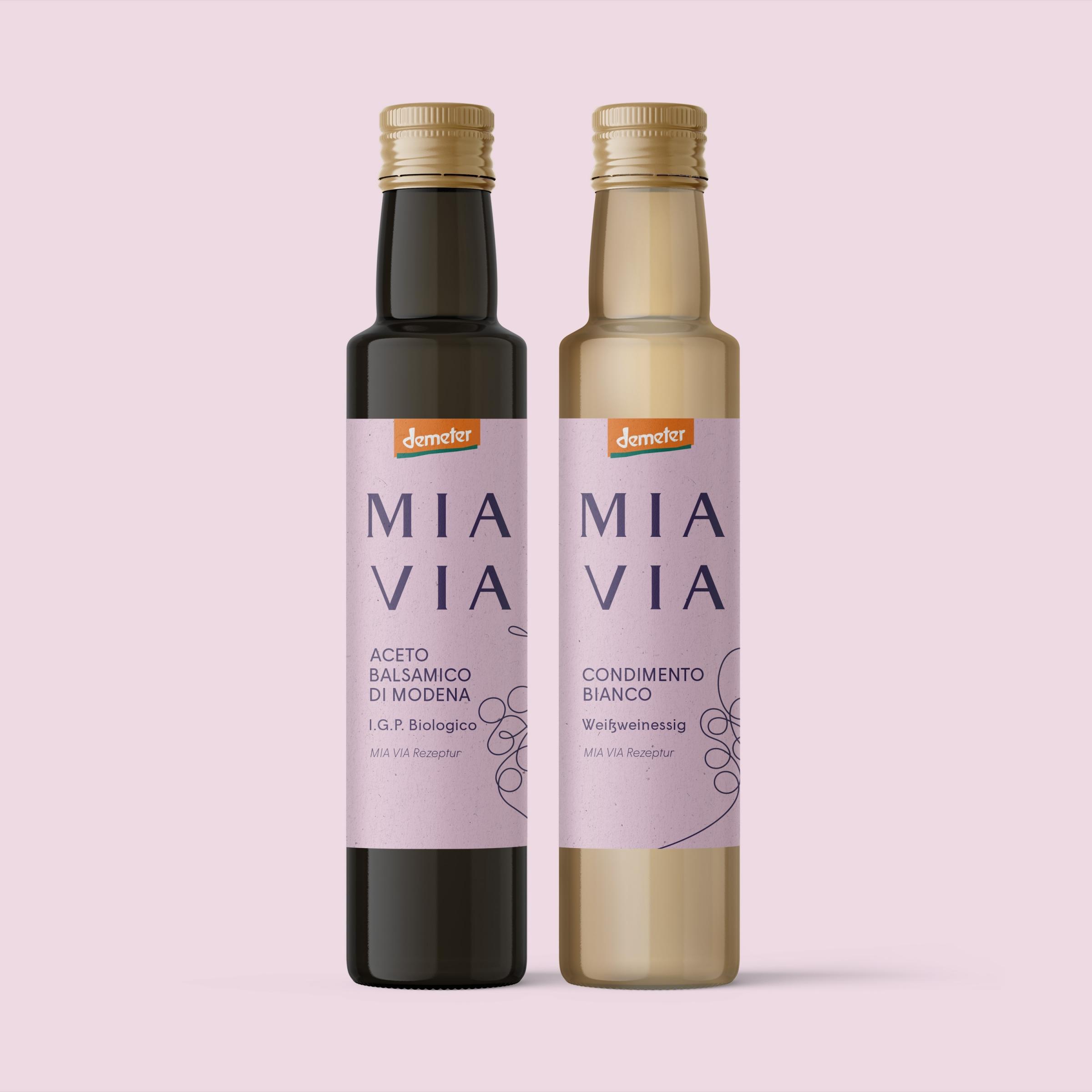
← Coloration of the vinegar labels.

← Some products feature characteristic Italian motives always following the on-liner path concept.
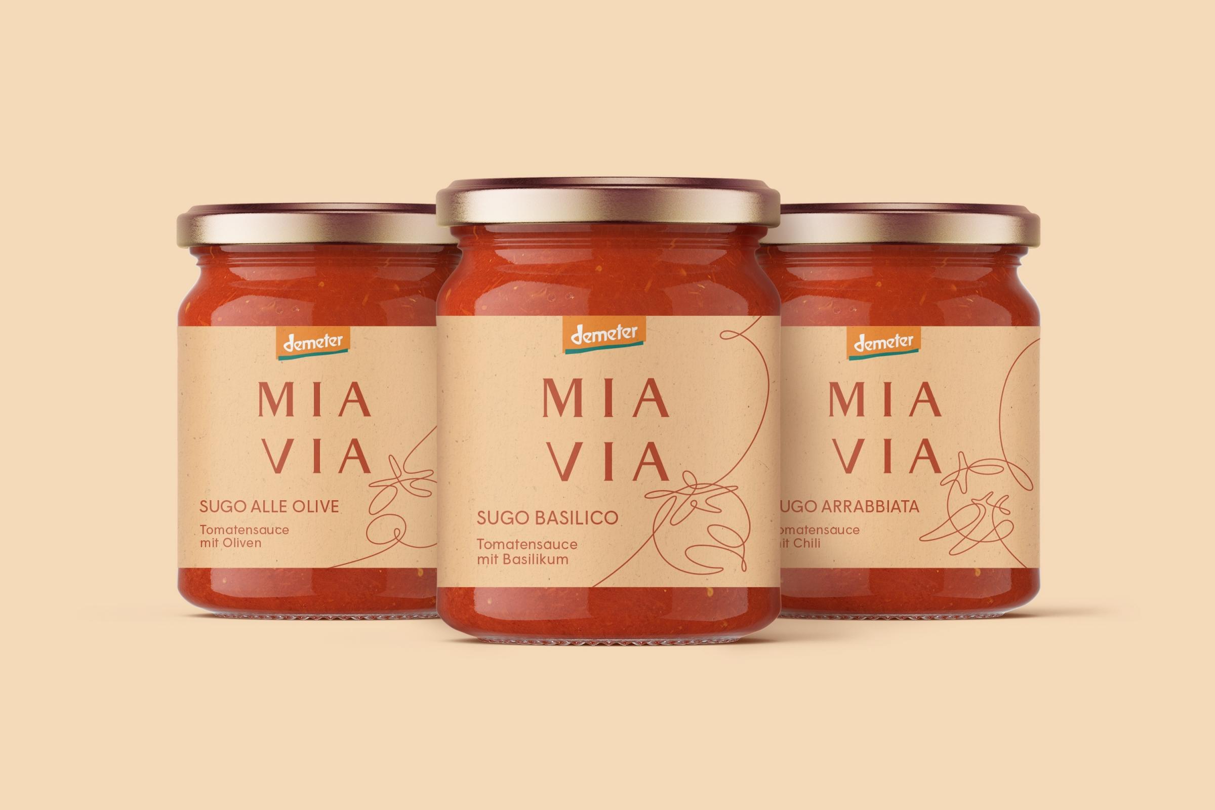
A variety of tomato sauce flavours. →
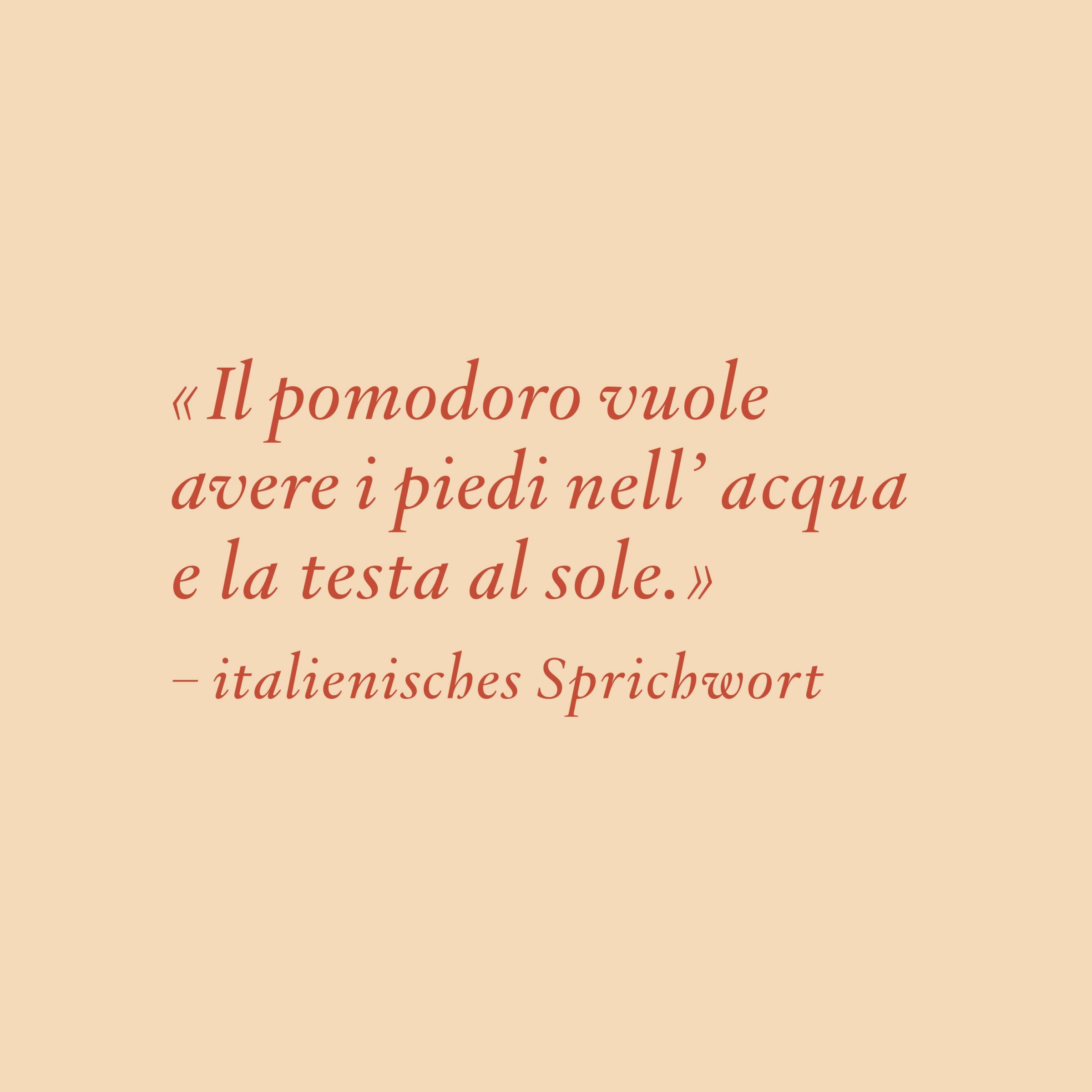
Each packaging features a traditional Italian quote that talks about the product.
The packaging label includes all the mandatory information. →
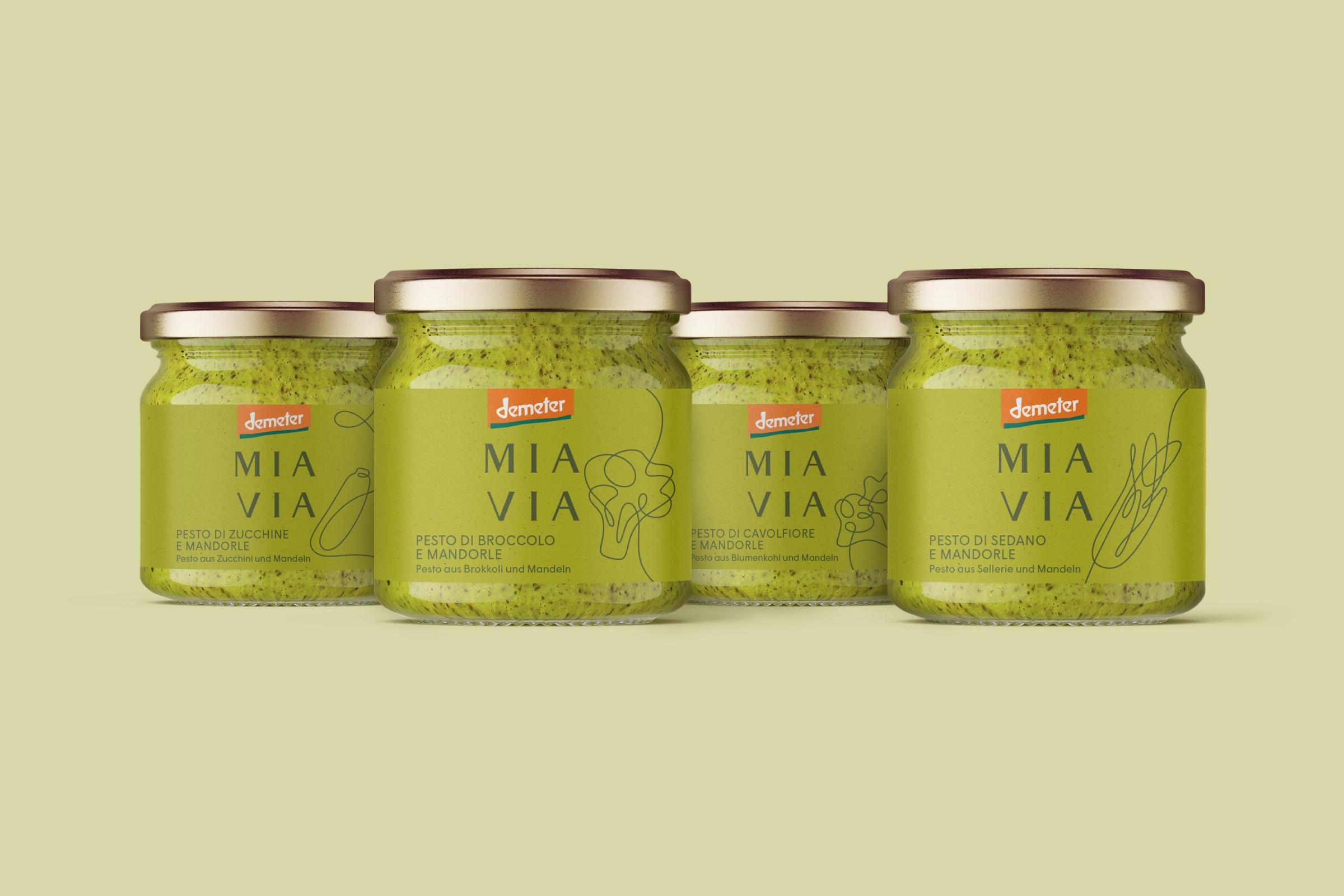
← A variety of pesto flavours.
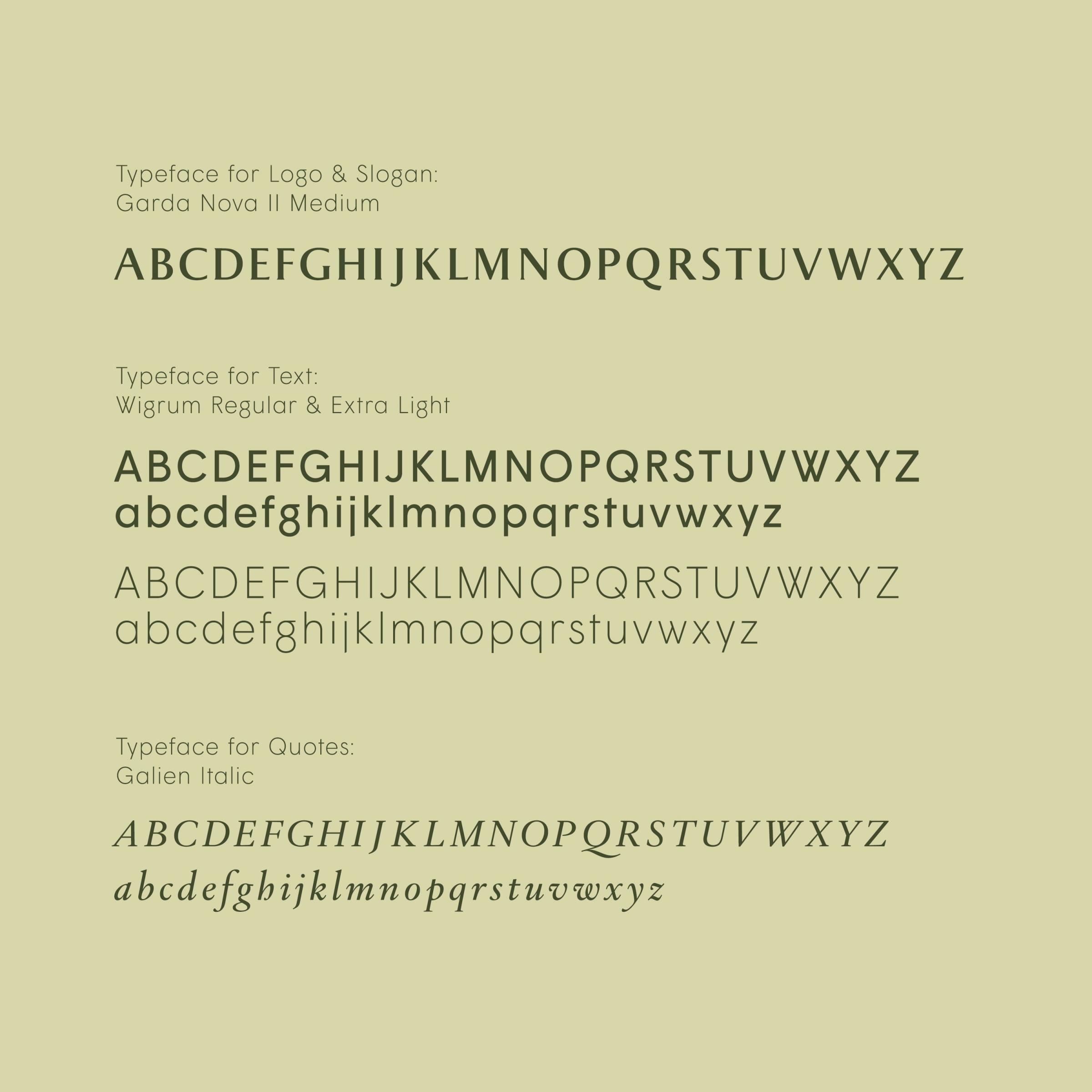
← Three typefaces are paired to create the MIA VIA brand identity. Garda Nova is used for the logo and slogan, the general text is set in Wigrum and quotes use the font Galien.
The red wine labels include illustrations of landmarks from the different Italian regions. →
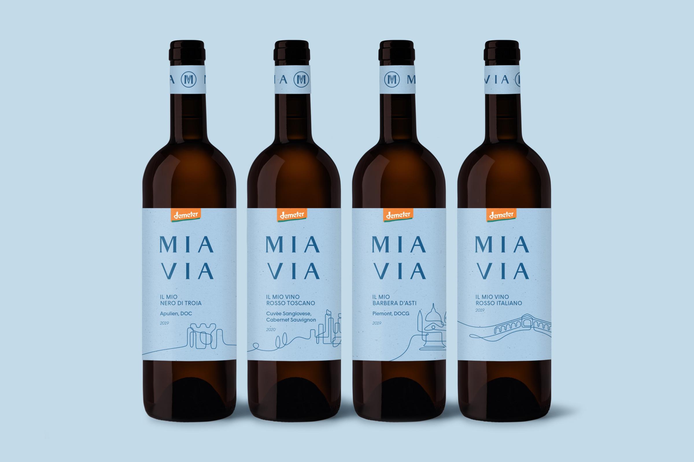
The “Barbera d’Asti” bottle shows Colle Santuario Don Bosco in Asti. The “Rosso Toscano” features the village view of San Gimignano in Tuscany. →


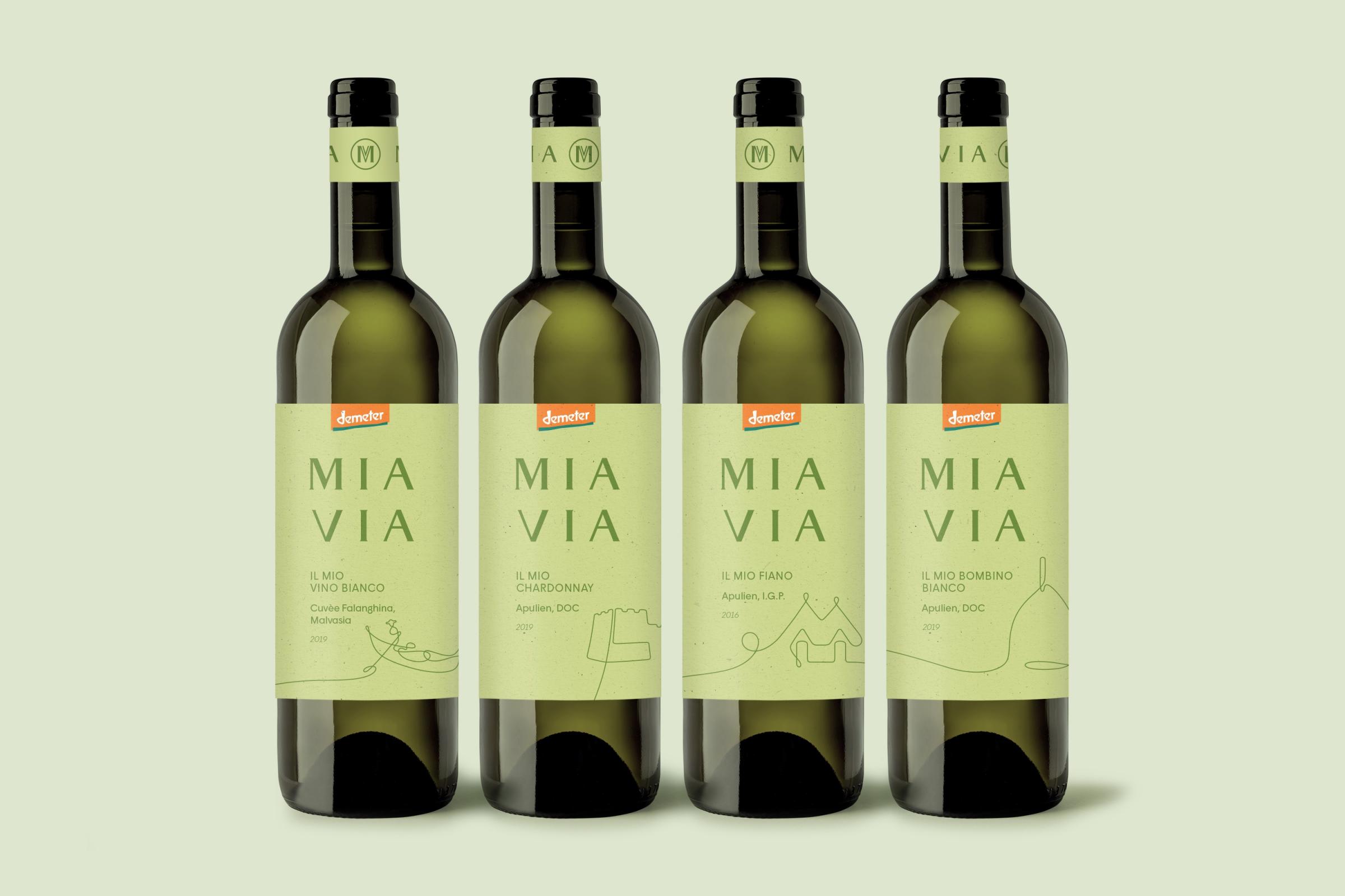
← White wine label designs.
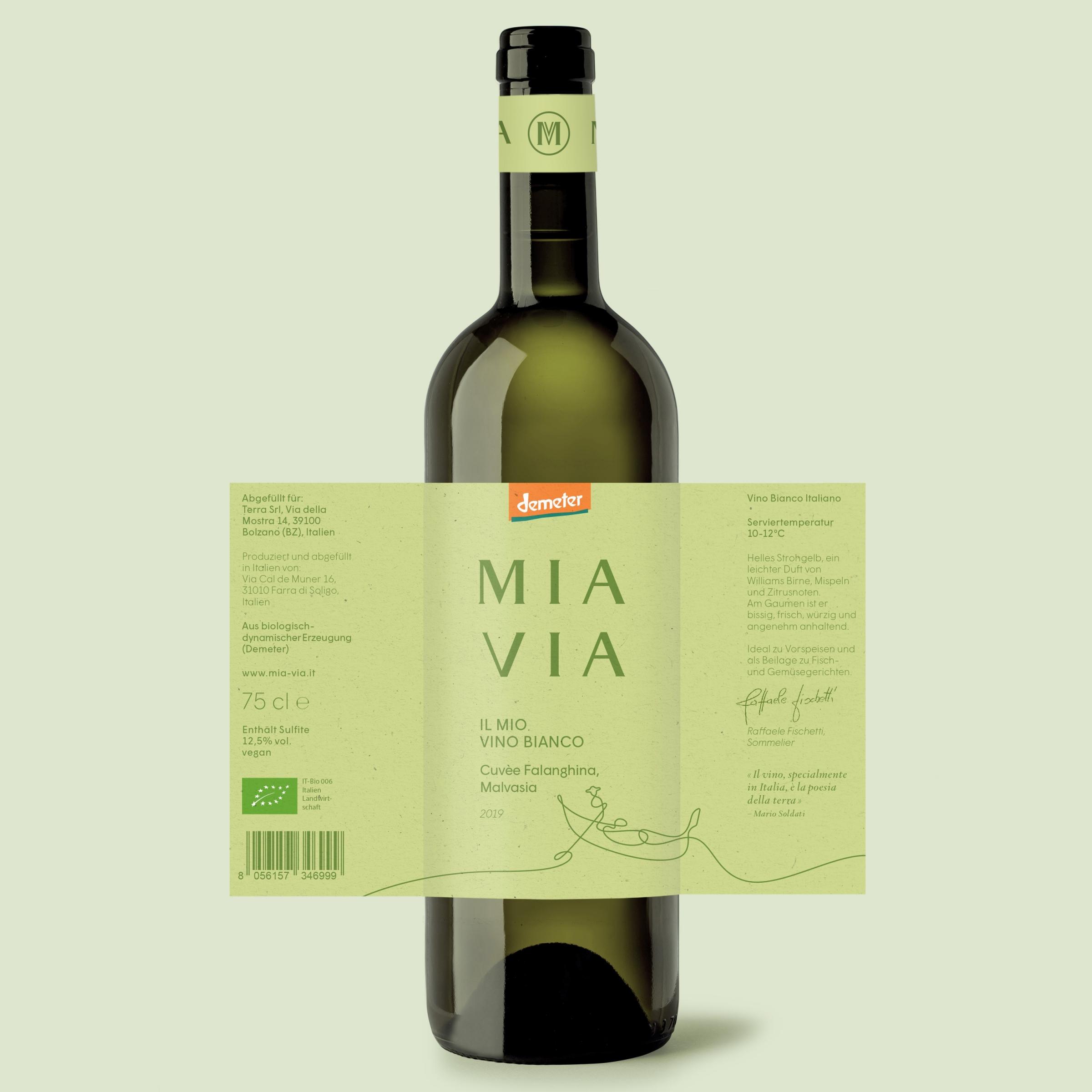
← The wine labels include information about what food they can be paired with.
Limited edition labels, like the Lombardia olive oil, make use of full bleed illustrations. →

↓
MIA VIA
Brand Identity & Packaging Design
Created in 2021
↓
Client: Terra GmbH
Creative Direction & Design: Philipp Zurmöhle, Nico Vogelsang, Franz Sickinger
Collaborative project with Picpacker Motion Design
↓
View project on:
Behance