Picpacker Motion Design
Brand Identity
Picpacker ideate and produce quality moving content.
Their films and animations come in different styles and forms.
The brand identity we designed for them reflects that shape-shifting notion of their way of working.
While most of their work happens digitally they meet people in real life – acquiring new clients in physical meetings or on set filming the content.
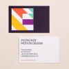
Business cards express their own identity and leave a lasting impression.
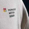
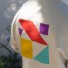
Picpacker’s logo is made up by different combinations of geometric shapes.
The flexibility of the mark highlights the versatile mode of practice the studio embodies.
The shapes from the logo make up a lively pattern that can be used in printed material like this notepad…
Suggesting movement the geometrical patterns create a colorful vibrant setting for Picpacker’s striking imagery.
↓
Picpacker Motion Design
Brand Identity
Created in 2024
↓
Client: Picpacker Motion Design
Creative Direction & Design:
Philipp Zurmöhle
Project Management: Johannes Bösser
Stationery Photography: Robin Tielker
↓
Picpacker – Excellent Motion Design from Hannover, Germany.


