Procure Ai
Brand Identity
Procure Ai’s brand identity is designed to combine a modern technical look-and-feel with the sophistication of a trusted brand.
Inspired by the rich history of computing, the aesthetic looks towards the future with a minimalistic visual approach.
The circle from the dotted logo can act as a graphical element in layouts. →


← Dotted pattern that makes Procure Ai’s procurement technology come to life.
The website has a futuristic feel and focuses on easy navigation. →
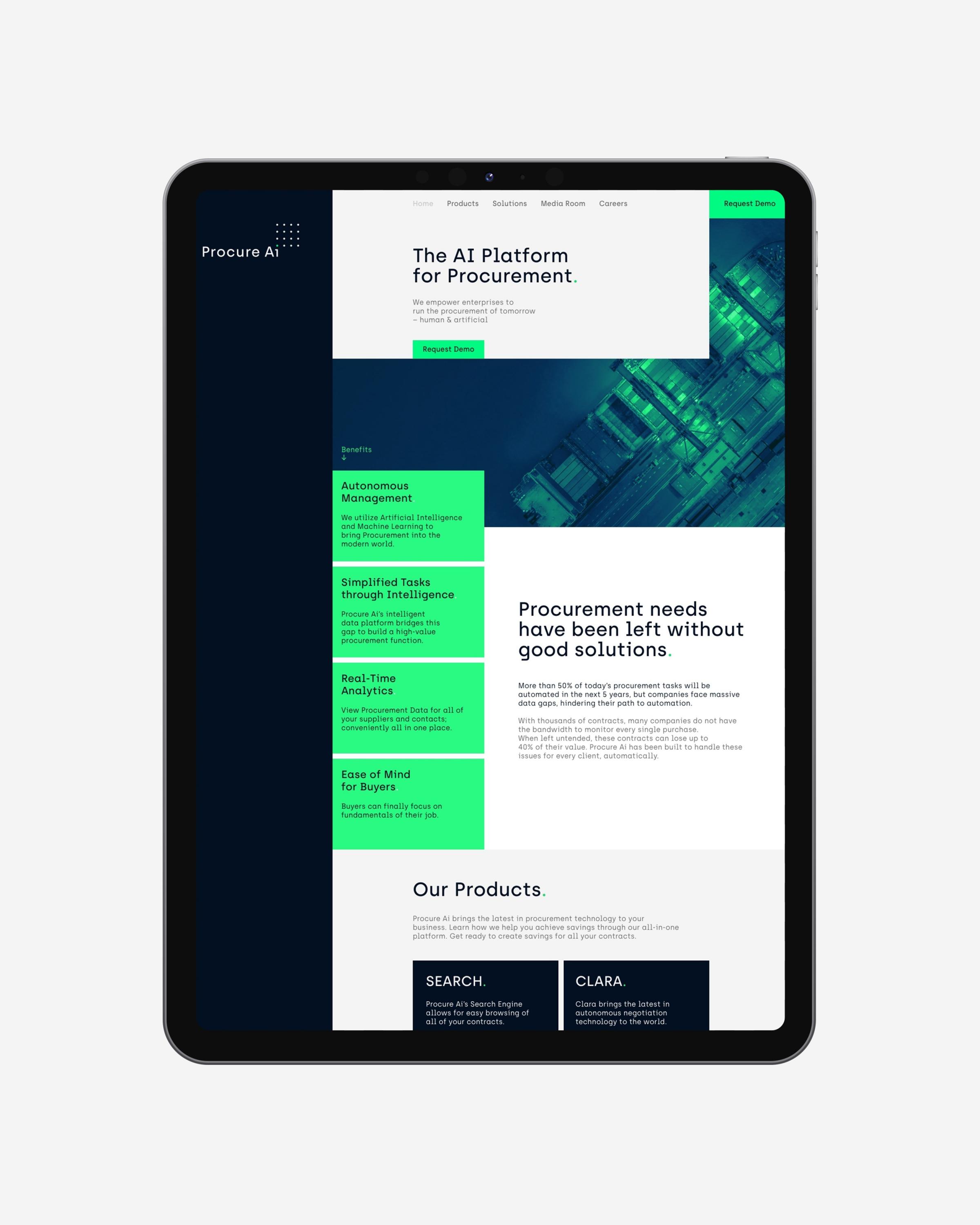
The bold typography focuses on straight-forward information. →

The typeface Archia has a technical appearance with a sympathetic human aspect. →

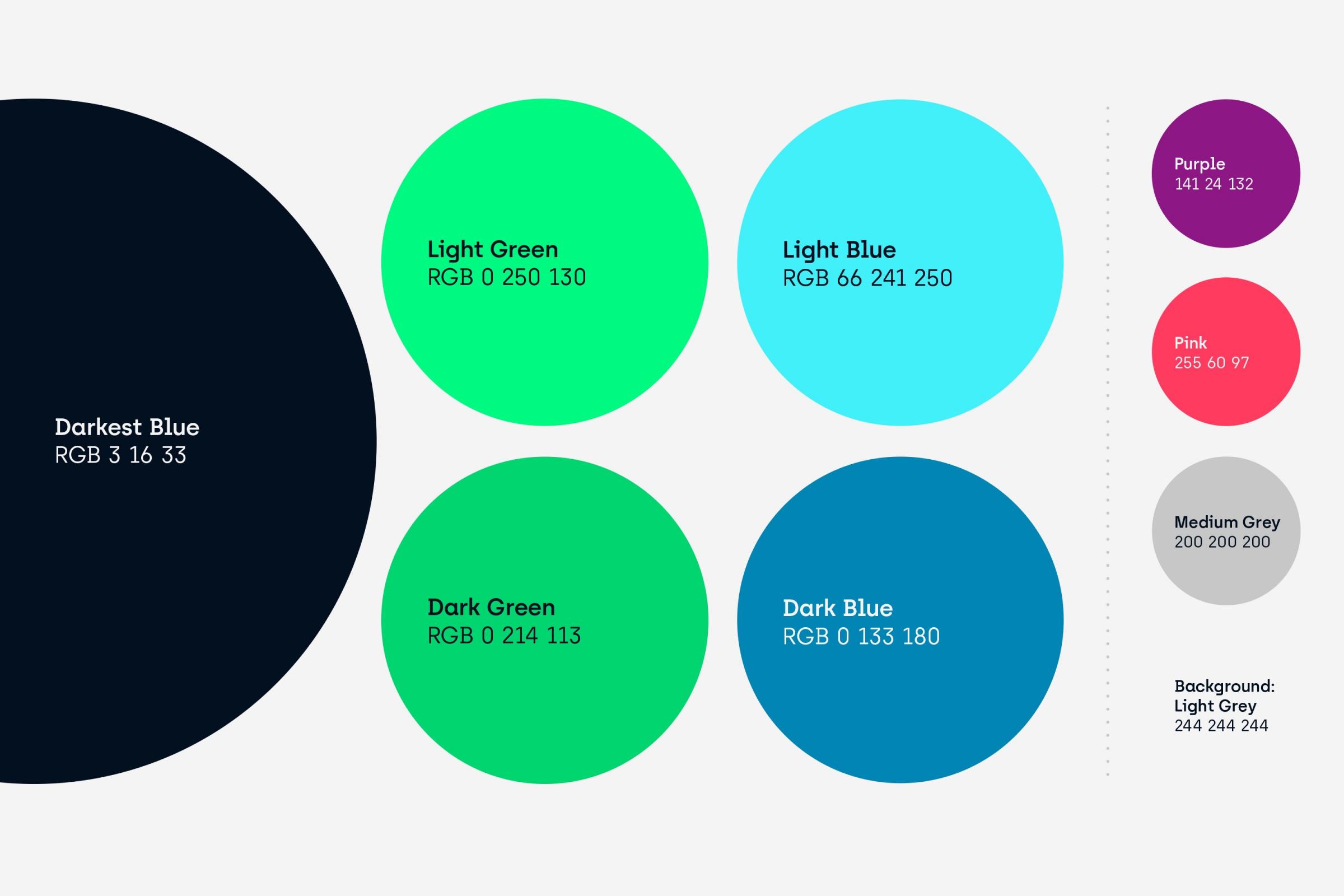
← The color palette enables the identity to either brightly get the viewer’s attention or lay out information in a toned-down way.
← The 16 dots in the logo are symbolizing data points that are organized and optimized.
It visually highlights one of them to express the diagnostics being done with the help of AI.

Images get a duotone coloring to bring real and digital processes together. →

← The icon for the web application uses the dots from the logotype while highlighting some dots to form an abstract P.
↓
Procure Ai
Brand Identity
Created in 2020
↓
Client: ProcureAi Ltd.
Art Direction & Design: Philipp Zurmöhle
↓
View project on: