Schaltraum Architecture
Brand Identity
Graphic identity, website and logo design for Schaltraum Architects from Hamburg, Germany.
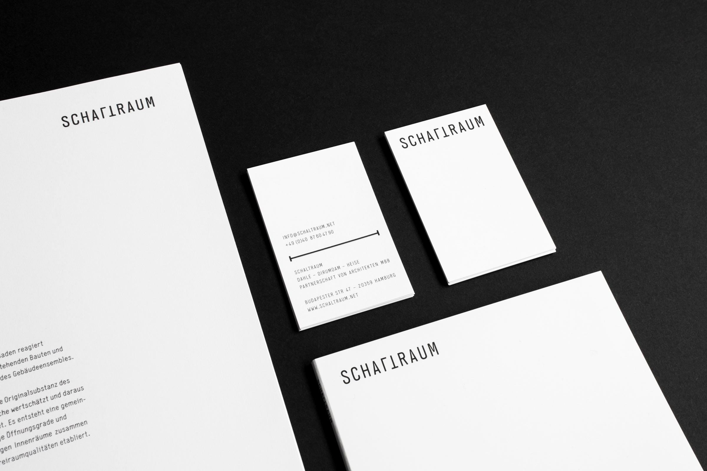
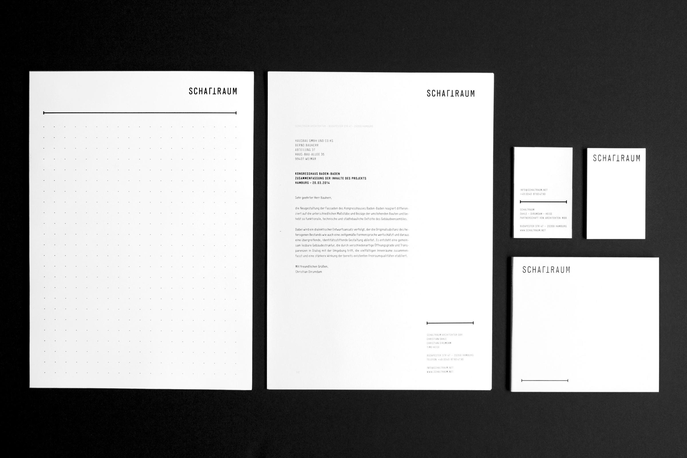
A minimalistic black and white layout that uses a lot of space creates a professional appeal and provides an effective stage for Schaltraum’s glossy architectural images.
In an architectural groundplan a “Schaltraum” (german) is a room that can be assigned to different usage purposes. The turned letters L and T in the logo visually create this room and subtly show the versatility of the studio. →


← The website is designed to leave a lot of room for big images.
Responsive web design makes sure that the content can be viewed easily on different devices like phones and tablets. →


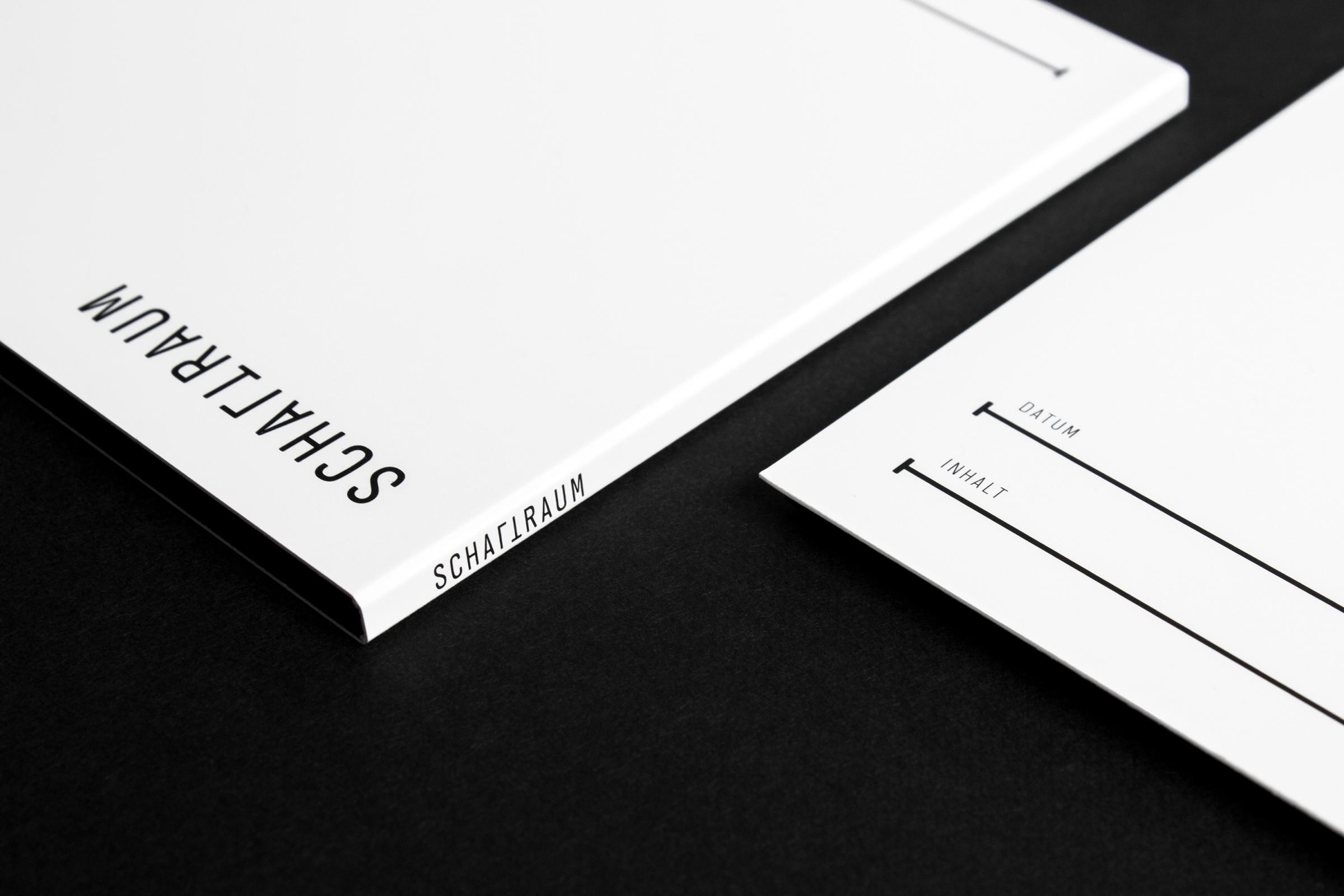
The stylized measurement line is used as a graphical element that interacts with the logo. →
A map of Schaltraum office’s surroundings in Hamburg to guide their visitors. →