VON & ZU BUCH
Book Store Identity
Visual identity and retail concept for Philipp Zurmöhle’s art and design book store in Nürnberg, Germany. The assortment of the shop covered books that were especially well made.
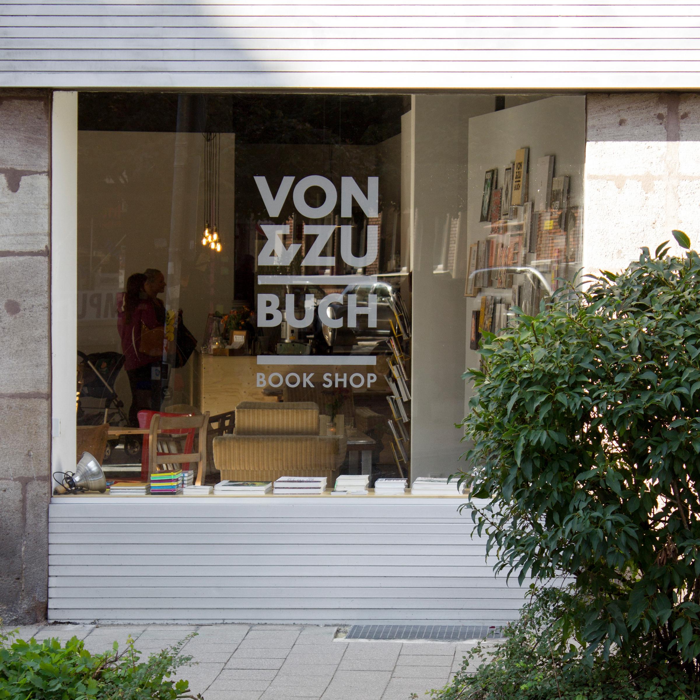
The minimalistic but bold look underlines the gallery feel of the retail environment.
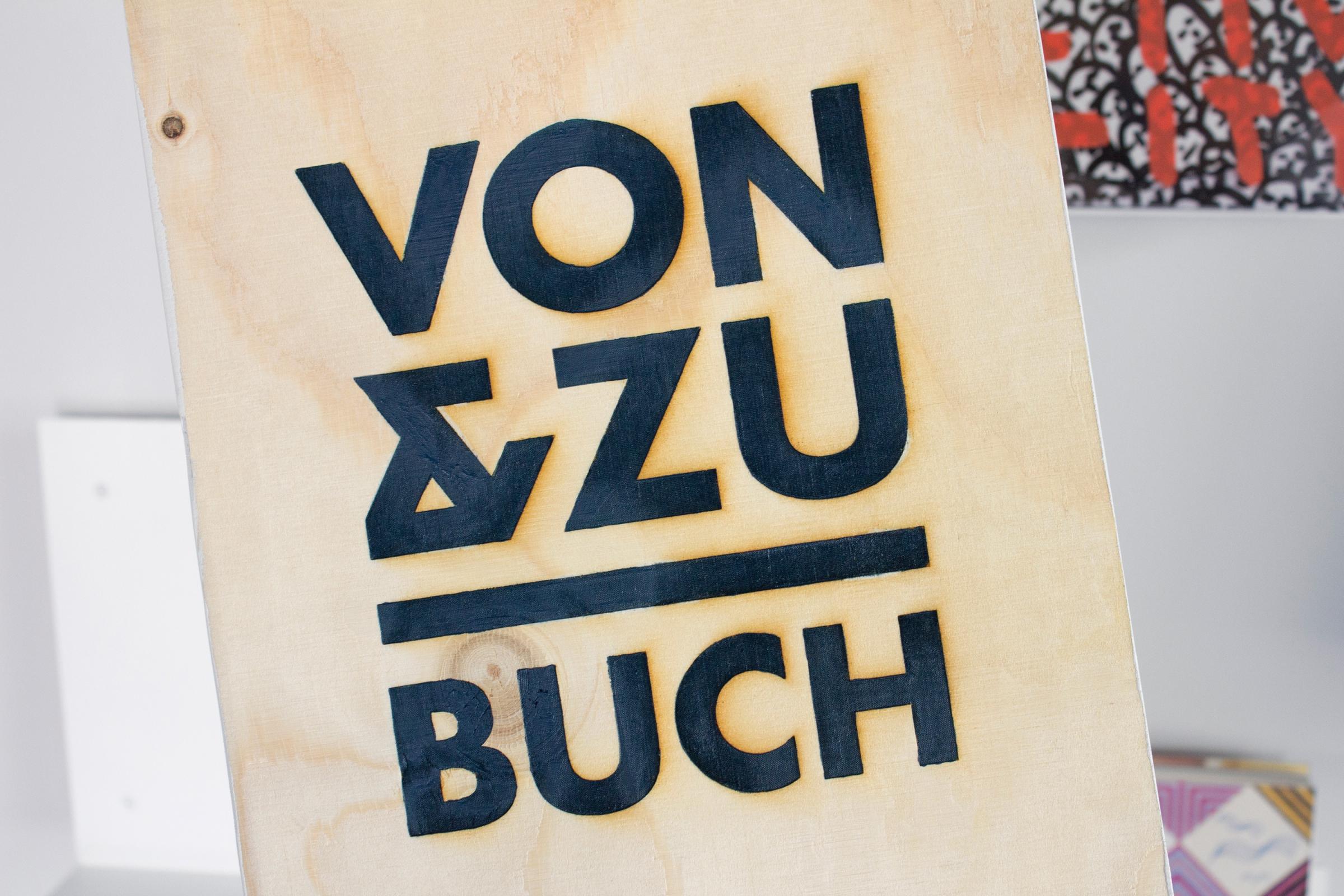
The name VON & ZU BUCH plays with how people used to call Philipp Zurmöhle “Herr Von und Zu”, relating to his last name.
The German words von and zu also mean from me to you – I pick special books and you can enjoy them. →
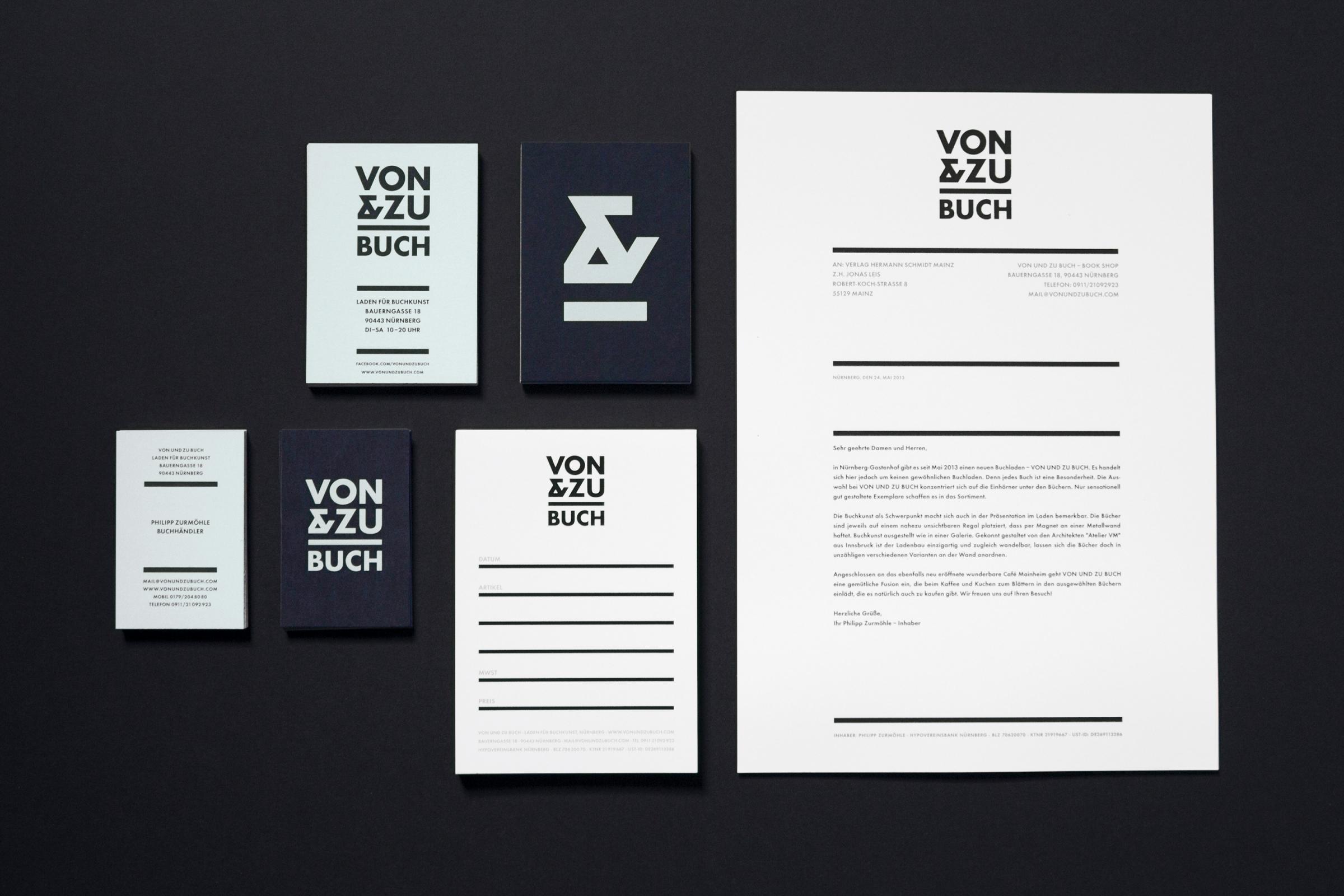
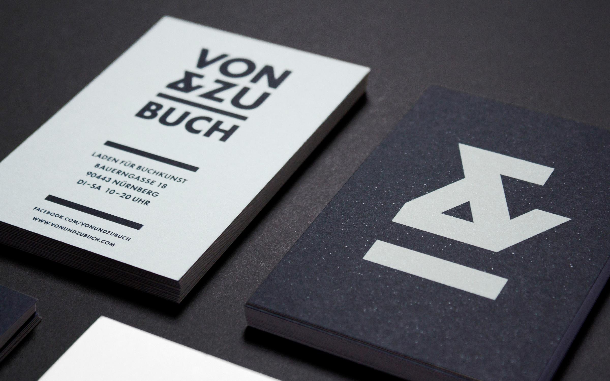
← The horizontal line in the minimal logo resembles one of the little book shelves in the shop.
The ampersand combines the two letters V & Z from the name to create a symbol that can be used on it’s own.

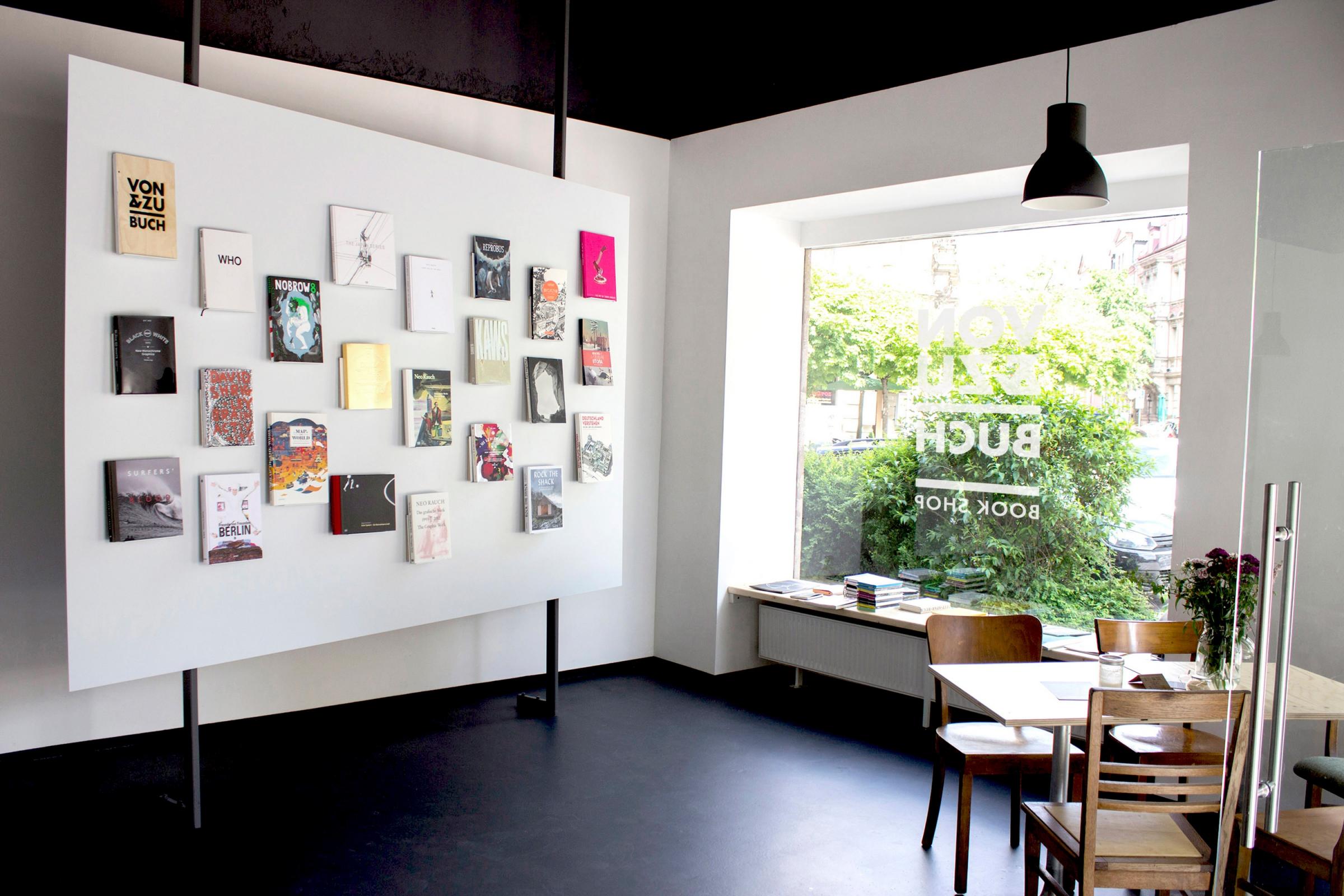
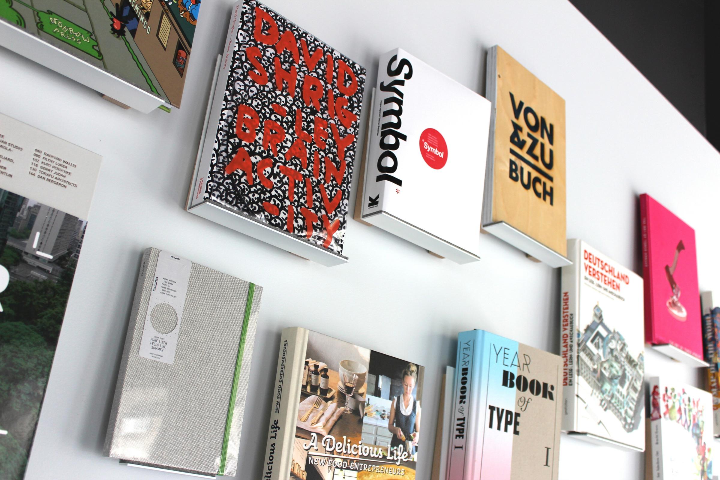
The retail wall is designed by Austrian Architect Maki Ortner. Each book is placed on a little shelf that is mounted on the metal wall with magnets.
That way the display can be changed now and then and the number of books shown can vary. →

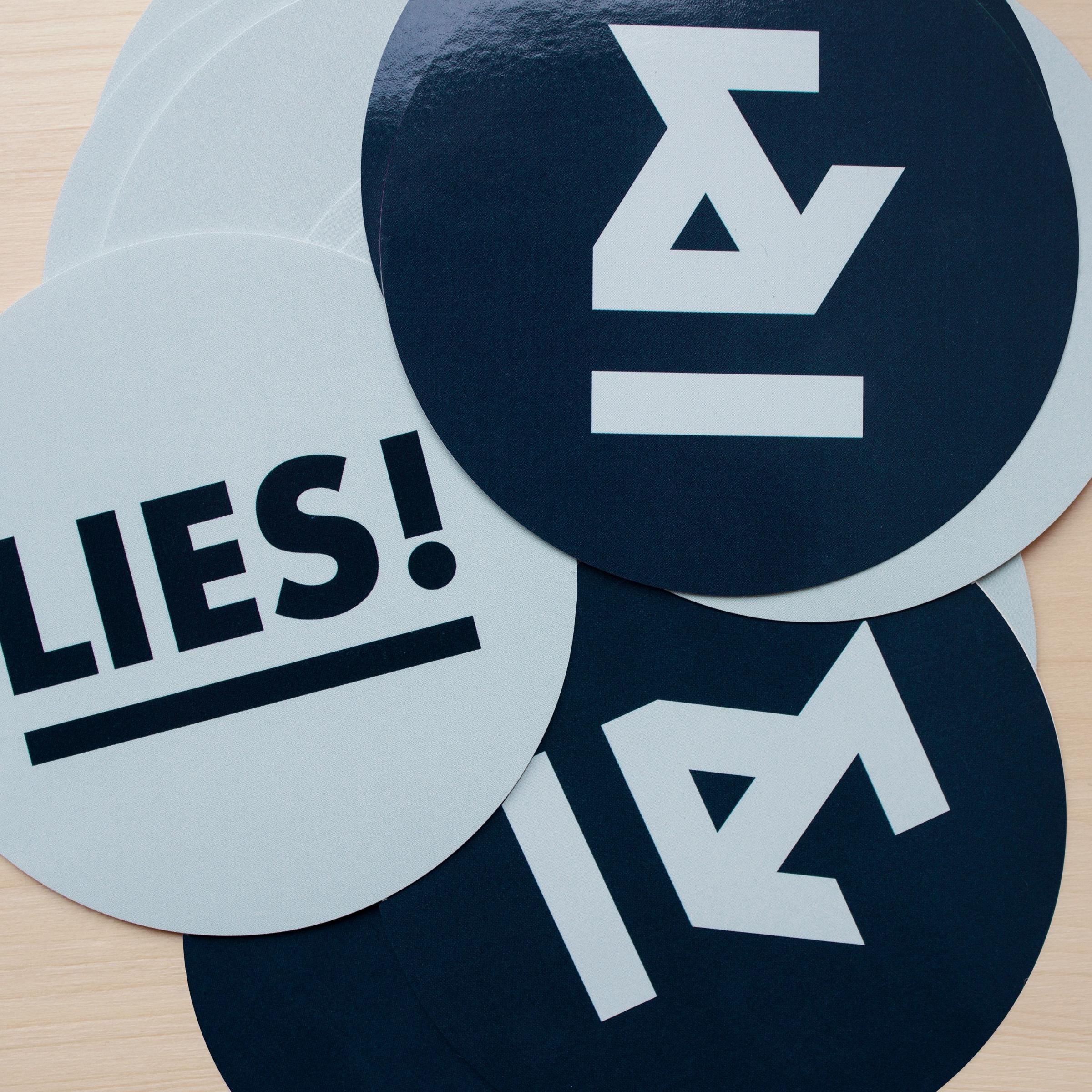
← The VON & ZU BUCH ampersand symbol as a stand-alone logo mark and a set of promotional stickers.

← VON & ZU BUCH Stationery and business cards.

↓
VON & ZU BUCH
Book Shop Identity
Created in 2013
↓
Client: VON & ZU BUCH
Art Direction & Design: Philipp Zurmöhle
Retail Architecture: Maki Ortner